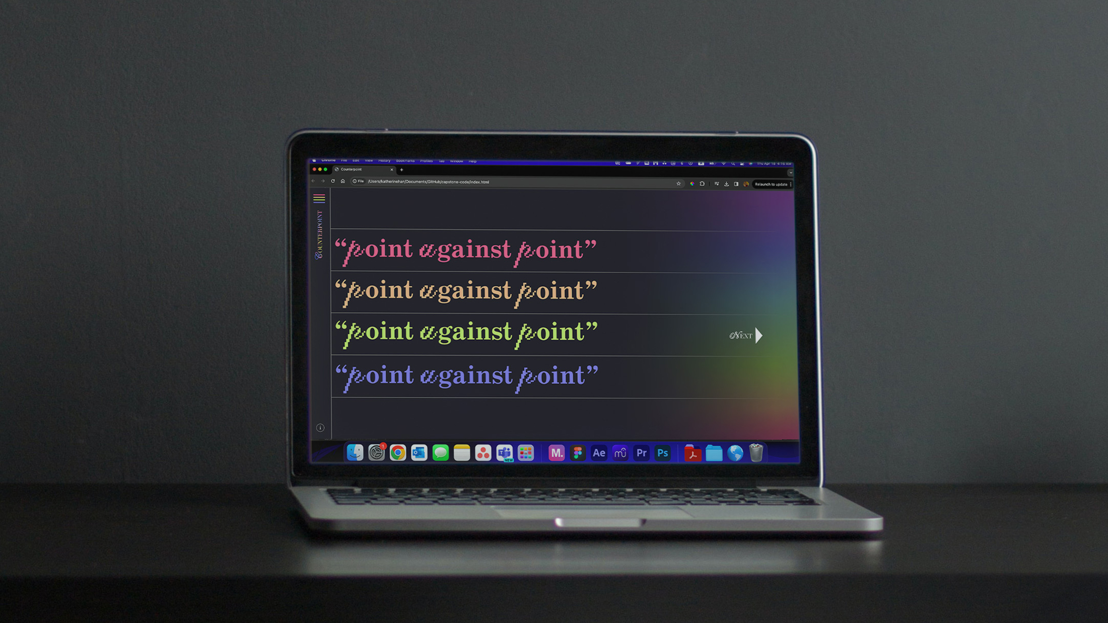
Counterpoint Website
See Full Website Prototype (View on Desktop)Scope
Functional Figma Prototype of an Interactive Audio Website
Music and Data Visualizations
Motion Graphics
Play & Mute Functions For Multiple Audio Tracks At Once
I designed a website that teaches the concept and history of the musical term counterpoint, a writing technique that incorporates multiple melodies on similar footing instead of just one main melody. I created music visualizations and audio interactions to solidify the written information for an informative and entertaining experience.
The What and Why
Horizontal Scroll and Grid
I used the unconventional horizontal scrolling direction to better demonstrate the lines of music over time. A vertical scroll would have forced the music into too many overlapping lines, making the information harder to understand. I also used lines in the background to act as a grid for the whole website, emulating sheet music.
Color Palette and Audio interactions
I used bright, vibrant colors on a dark background to "gamify" the experience and reference music producing software like Logic Pro. By adding mute/unmute functions, I gave users the option to listen to the melodies separately and all together to enforce the information through active listening and interaction. I also added a collapse/expand button so users could see how the melodies overlap better.
Image Treatment
I kept the image treatment consistent throughout the website by color treating them to match the palette. I also spliced and offset the imagery to mimic the different lines of melody I incorporated flowing gradients instead of only hard cutoffs between colors to mimic how melodies overlap and blend within counterpoint.
Typographic System
Throughout the website I used various typeface combinations in a set typographic system. For page titles and animated type, I used a fun pixelized script font (Pixel Script) combined with a high-contrast serif font (Essones) as a nod to both entertainment and music notation.
For the headers, I used just the high-contrast serif (Essones) to maintain legibility while differentiating them from the body copy, which was in a friendly and easy-to-read sans serif (Quasimoda). I also used another font with a distinctly techno vibe (Video) for the clarifying information that adds to the game-like aesthetic.
Mixing Station
In addition to the audio interactions in the historical and contemporary examples of musical counterpoint, I wanted to give people a chance to play around with multiple melodies and create their own combinations resulting in various instances of counterpoint. In most of the examples I provided, there are only two or three different tracks to mute and unmute.
In the mixer page, however, I provided 8 tracks each for 2 different key signatures, totaling in 16 tracks. By default, I hid clarifying information so as to not visually distract the user from the main attraction, the audio tracks, but they can easly reveal the additional content should they want to learn more.