Twenty Four Ours
Scope
Branding
Logos
Color Suite
Type Suite
Photography Direction
In collaboration with Rachel Tian
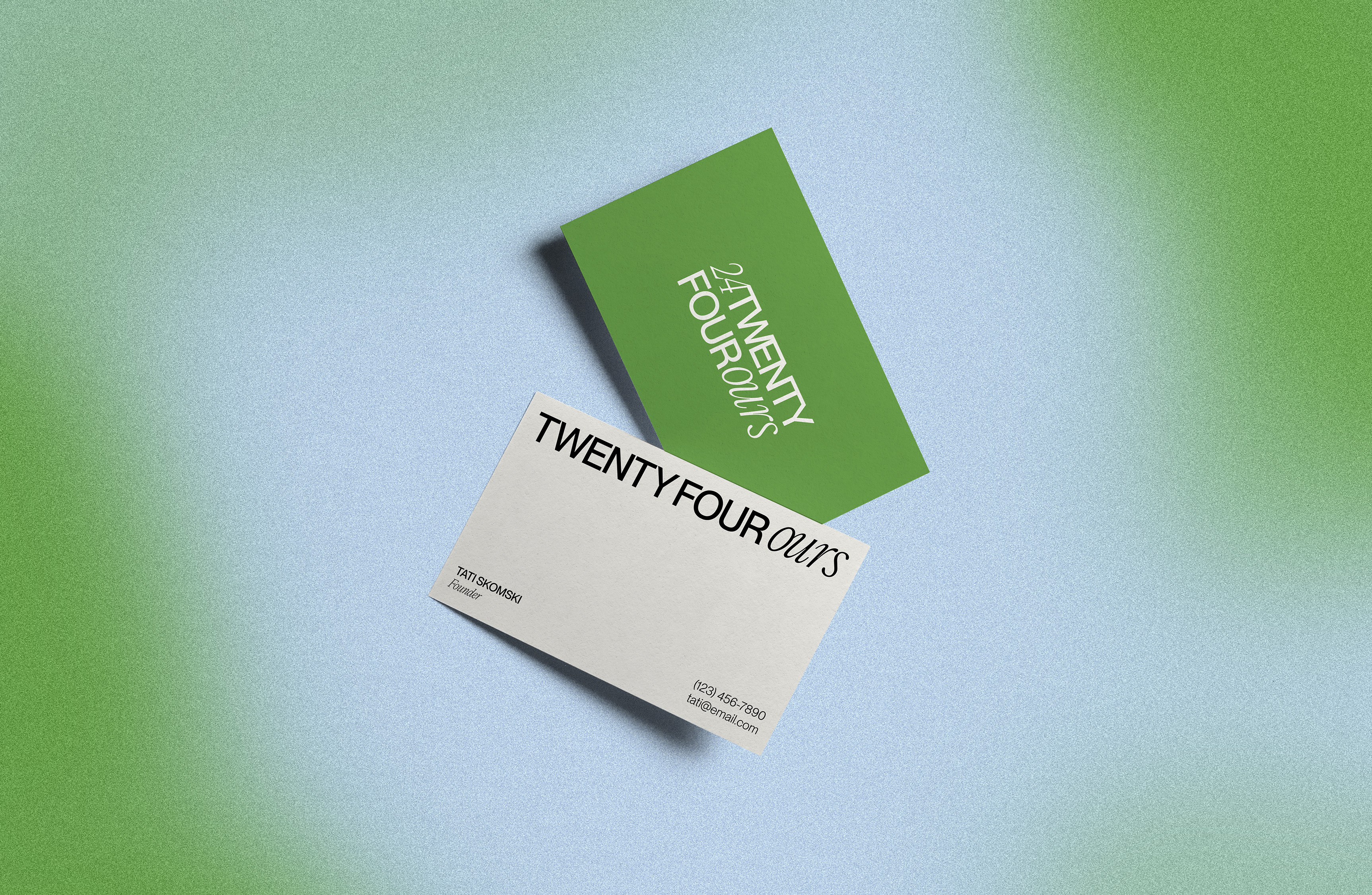
We developed a fresh brand identity for the launch of Twenty Four Ours Marketing, a growth-focused social media marketing agency founded by Tati Skomski Jalali that offers both organic and paid content. Featuring soft greens and blues, sleek letters, and candid photography, this identity is both elegant and welcoming.

The What and Why
Initial Iterations
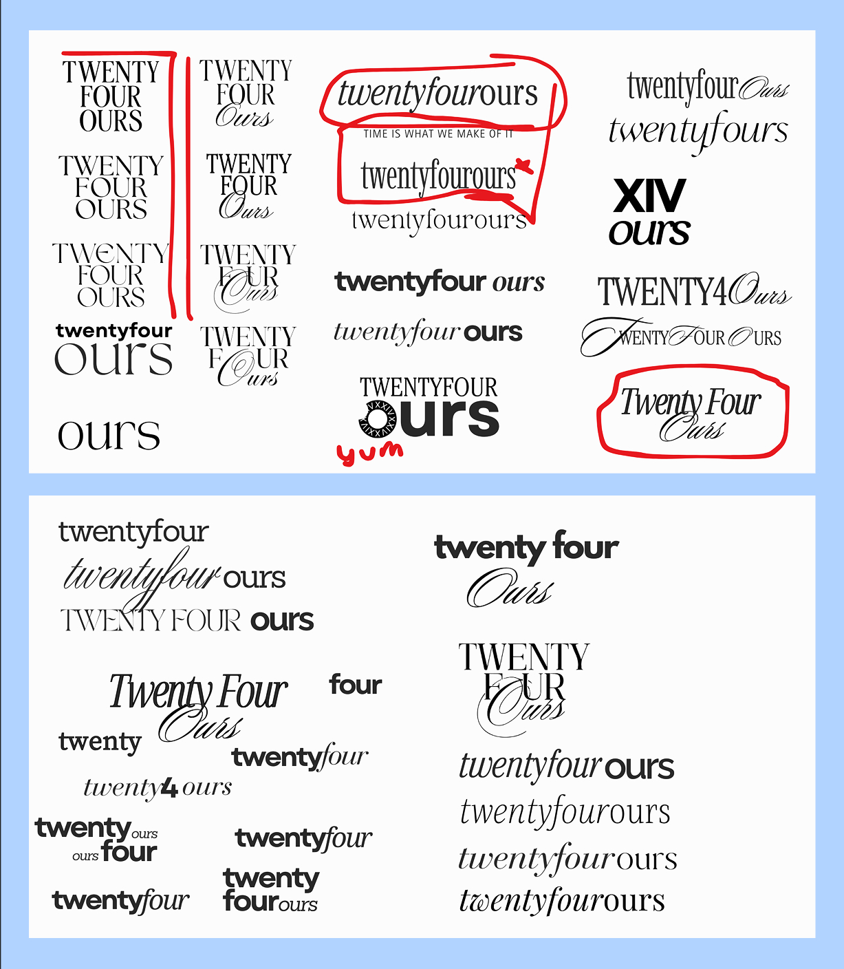
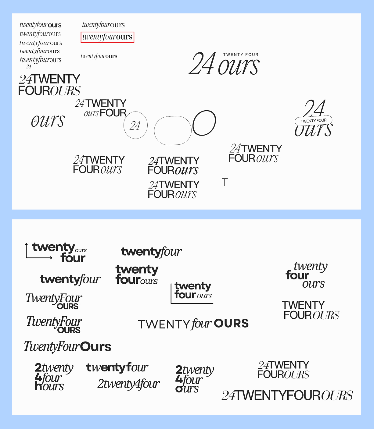
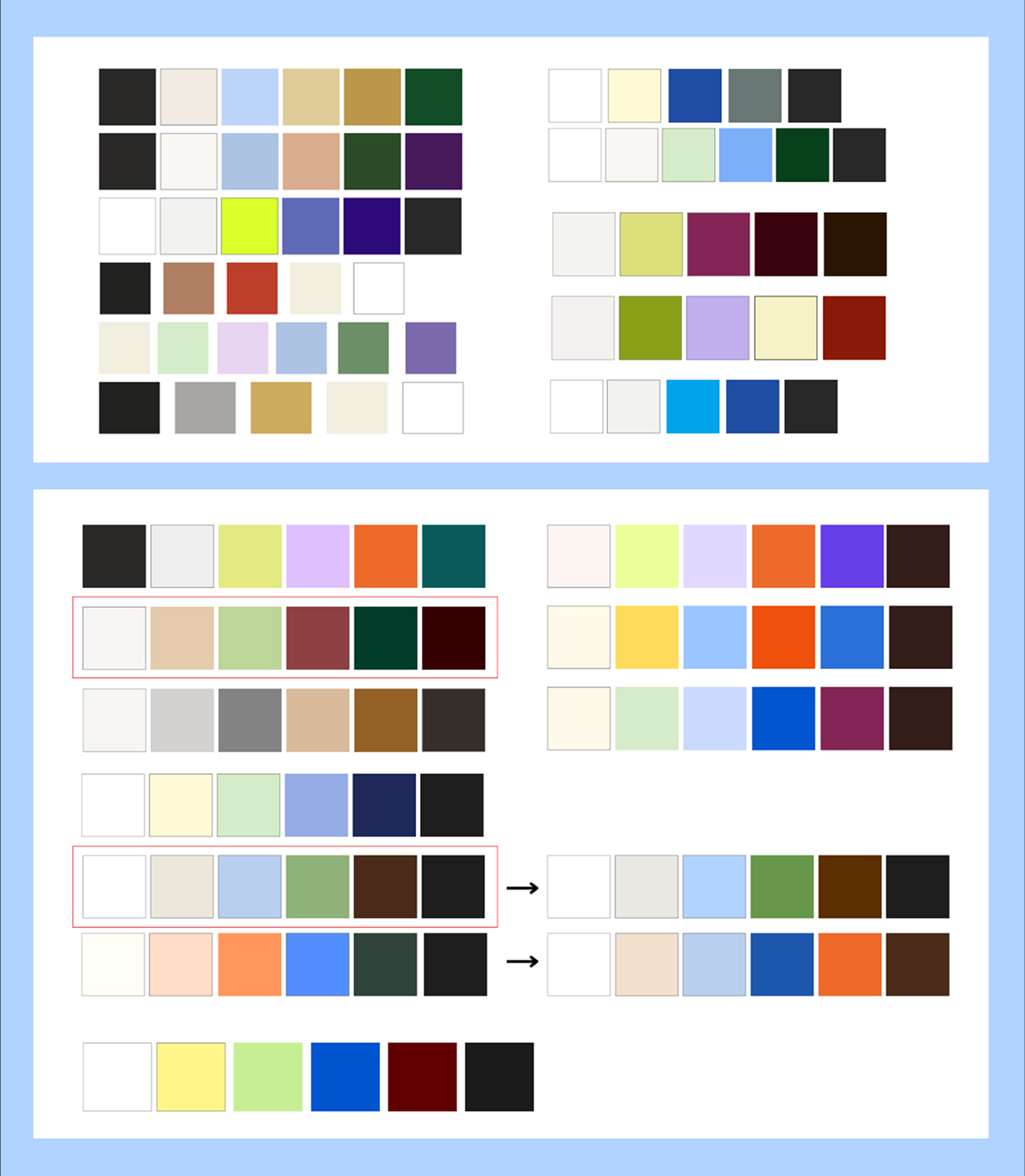
For the early stages of the brand iteration process, we experimented with many different fonts/type pairings in a range of different lockups to have more options to narrow down from. We leaned into type pairings where the fonts greatly contrasted with one another to achieve visual impact using only type.
We aimed for a blend of the ornate and the sleek to evoke both elegance and modernity. Striking this balance proved to be more challenging than anticipated, but after some trial-and-error, we generated a few options that achieved this effect with varying levels of simplicity.
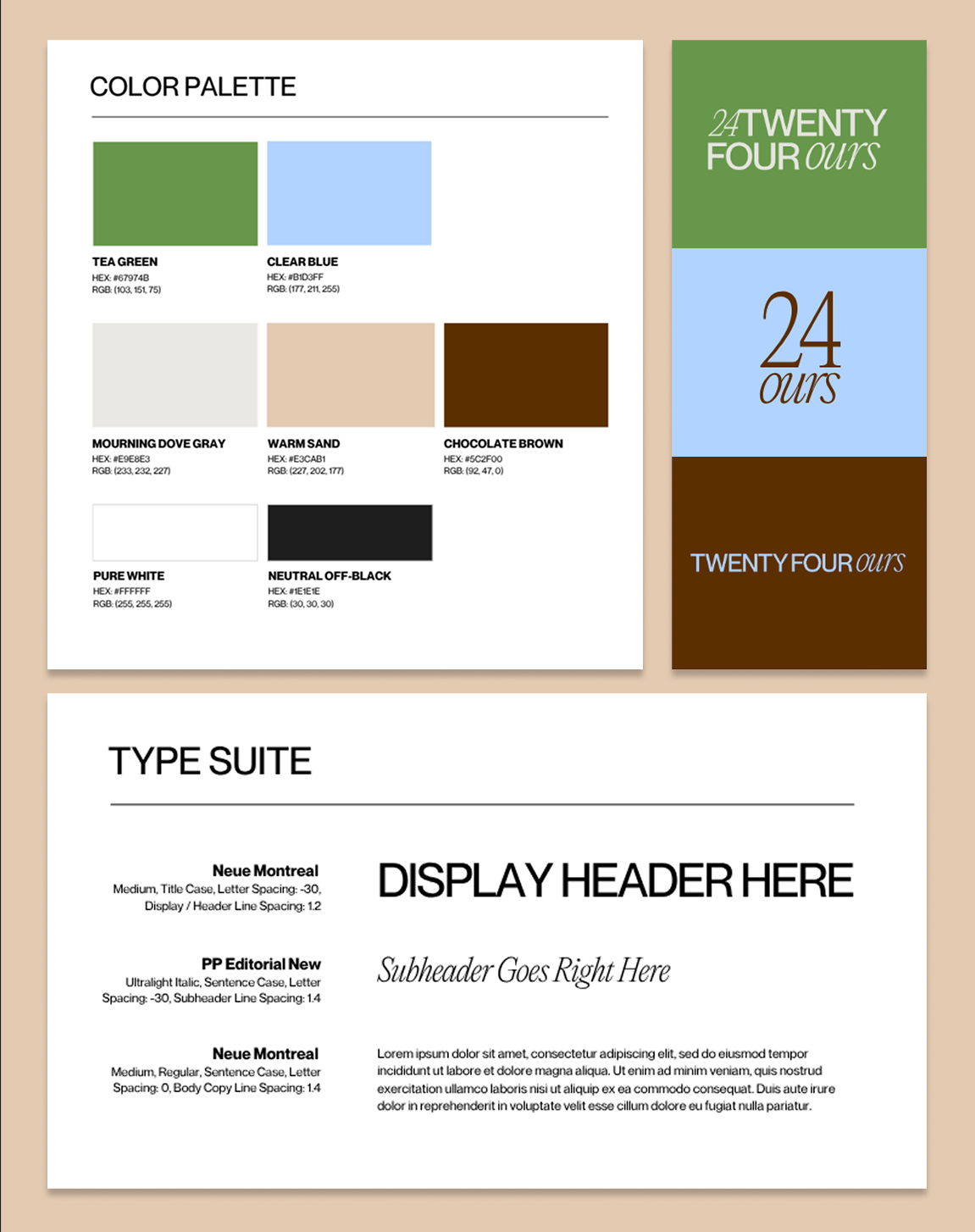
For the color palette, Tati, the founder, wanted some distinct colors that were easy on the eyes instead of mainly neutrals or super vibrant shades. We landed on three very different options, from rich deep tones to brighter complementary colors.
Creative Directions
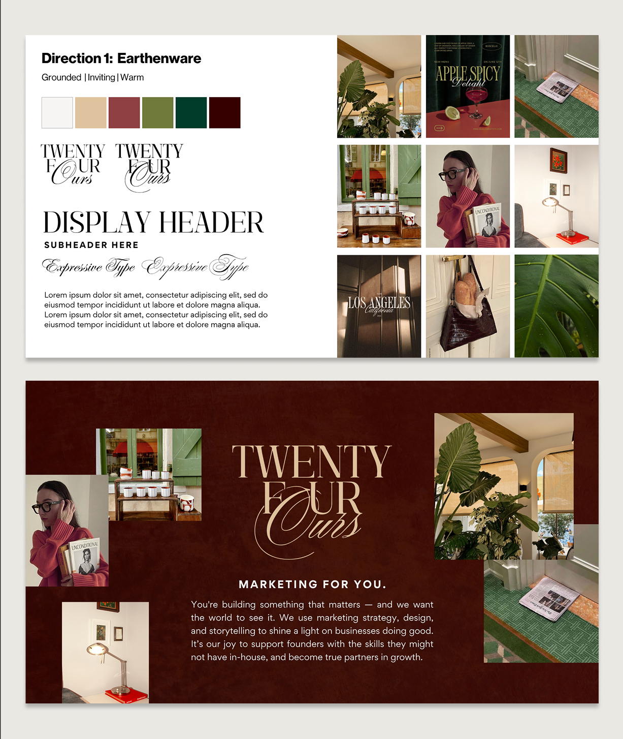

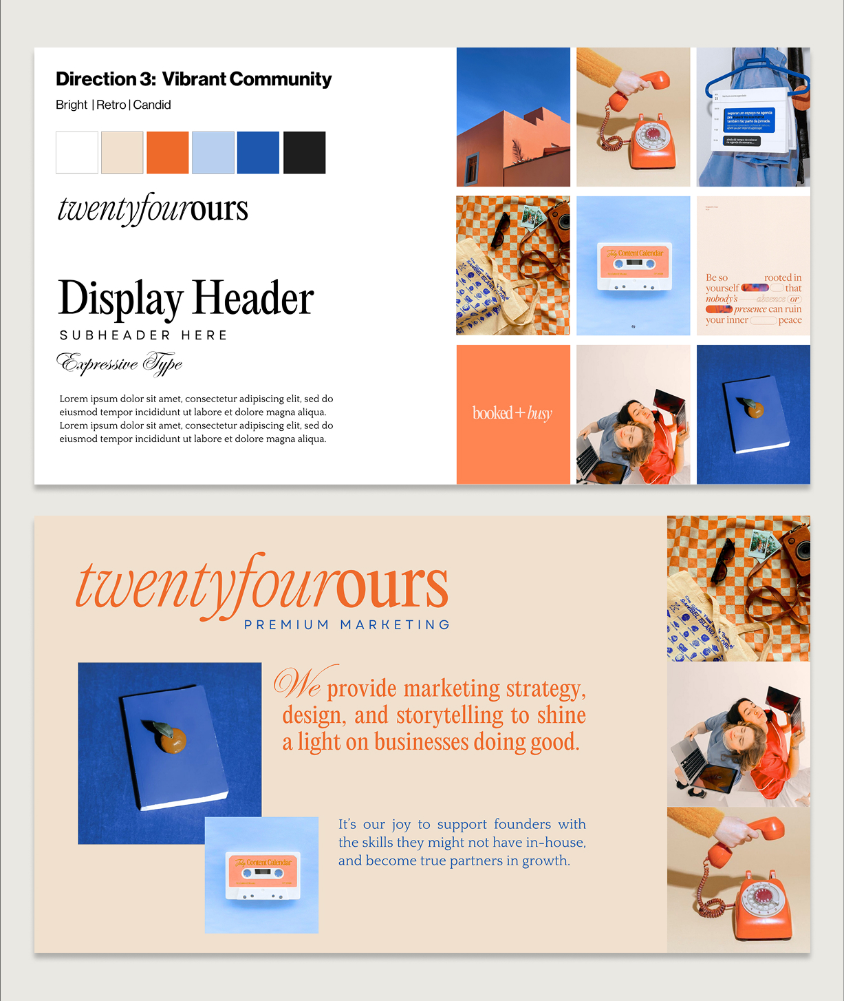
We then developed three distinct creative directions for the Twenty Four Ours brand. For Direction 1: Earthenware, we used deep, warm tones and expressive typography for a more grounded look and feel. For Direction 2: Everyday Elegance, we used clean layouts, refined type, and soft cool tones to communicate simplicity and quiet luxury.
For Direction 3: Vibrant Community, we introduced a retro-inspired palette and playful details to really lean into the dun and personal. Together, these directions gave the client a range of elevated but accessible brand possibilities, ranging from polished and classic to lively and modern.
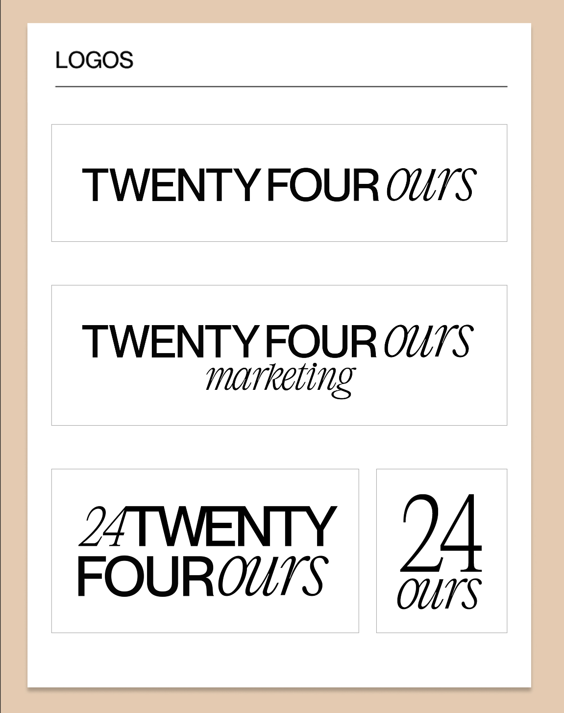
The founder fell in love with Direction 2 for its softness and versatility. To achieve the high-end look, we used a clean sans-serif font reminiscent of luxury clothing lines and paired it with a contrasting font for visual impact. To appear more warm and inviting, we used soft greens, blues, and neutrals.