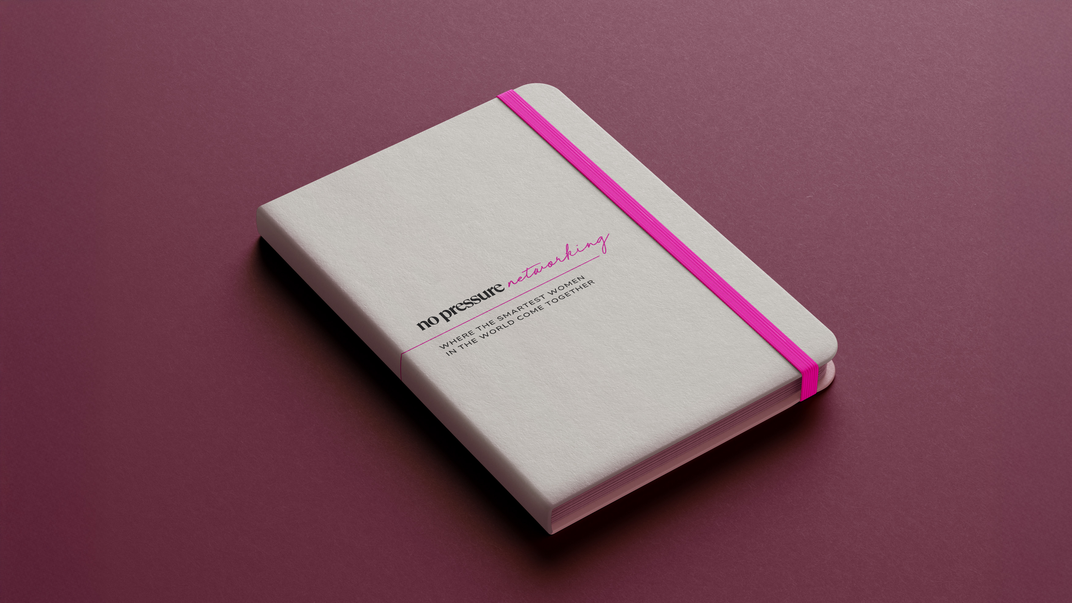
No Pressure Networking
Scope
Branding
Color Suite
Type Suite
Photography Direction
Branding Guidelines Slide Deck (22 Page)
I was tasked with rebranding and creating extensive branding guidelines for No Pressure Networking, which connects female investors with founders, fostering collaborations between startups and advisors, & uniting women angel investors with other investing and VC professionals.
In collaboration with Rachel Tian

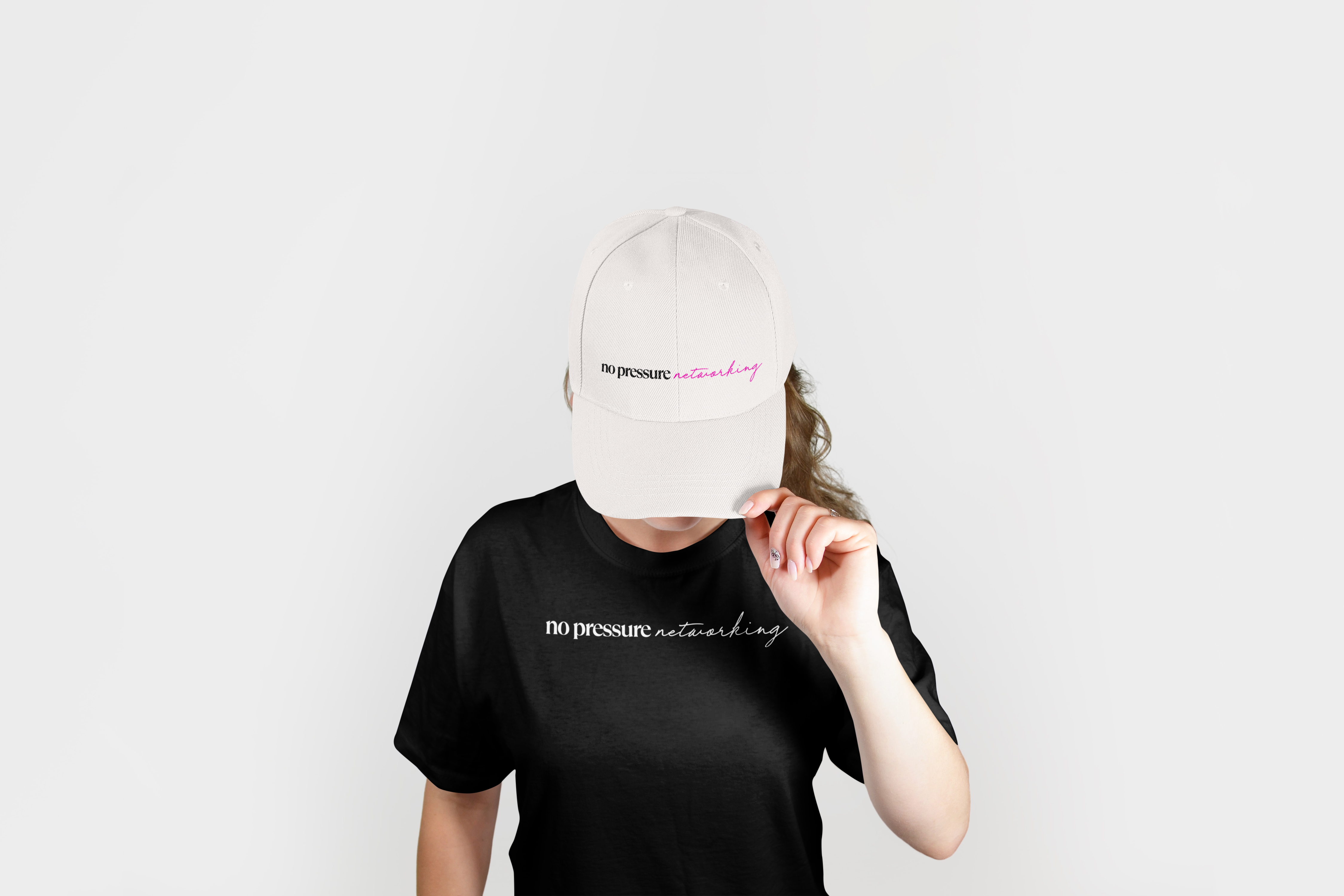
The What and Why
Creative Directions
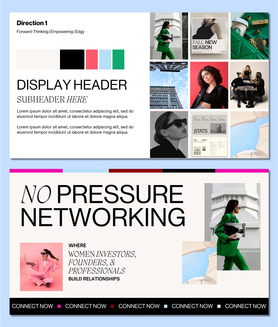
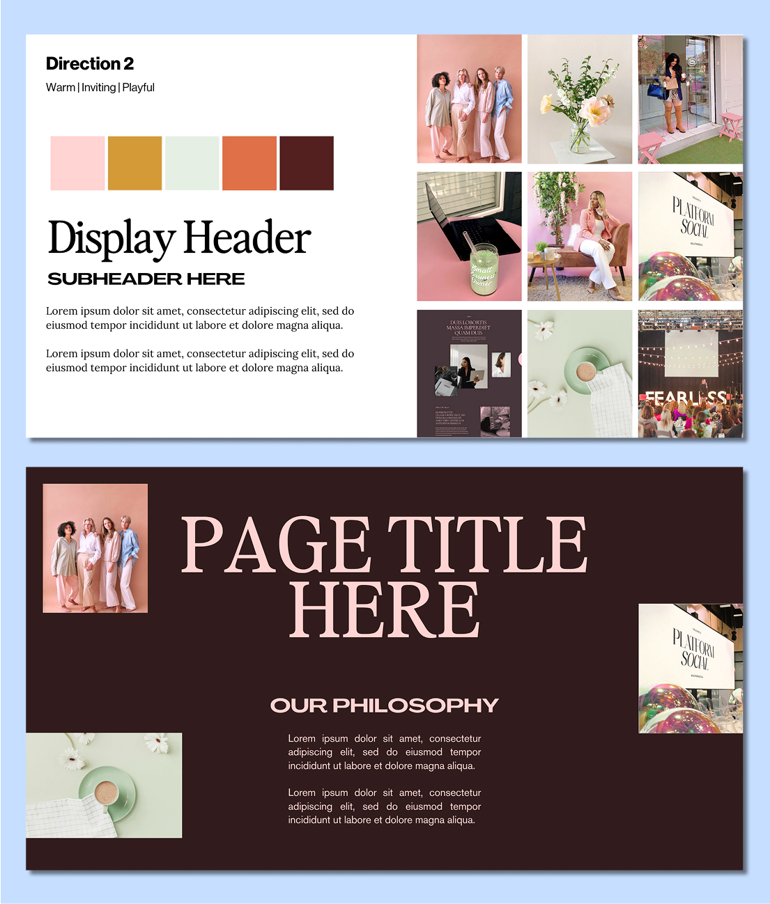
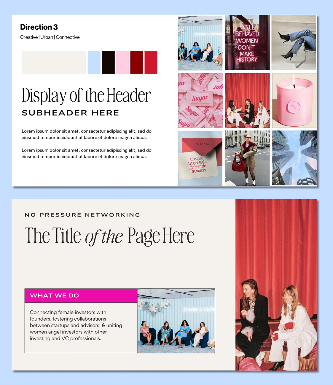
No Pressure Networking’s initial task for our team was to create a brand card that established the color suite, type suite, and photography direction. As pictured above, the first step was to present three distinct creative directions for the client to choose from based on their inspiration.
We captured the brand’s bright, high-end vibe by pairing vibrant colors with soft creams and off-blacks. We used tall serifs to convey luxury and clean sans-serifs for clarity and contrast. We also created a cohesive photo grid for each direction that set its distinct tone (i.e. empowering vs. playful).
Mini Brand Card
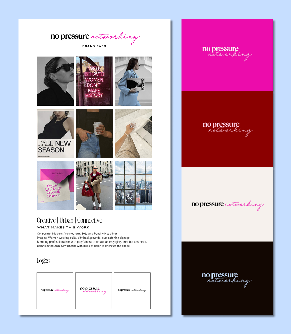
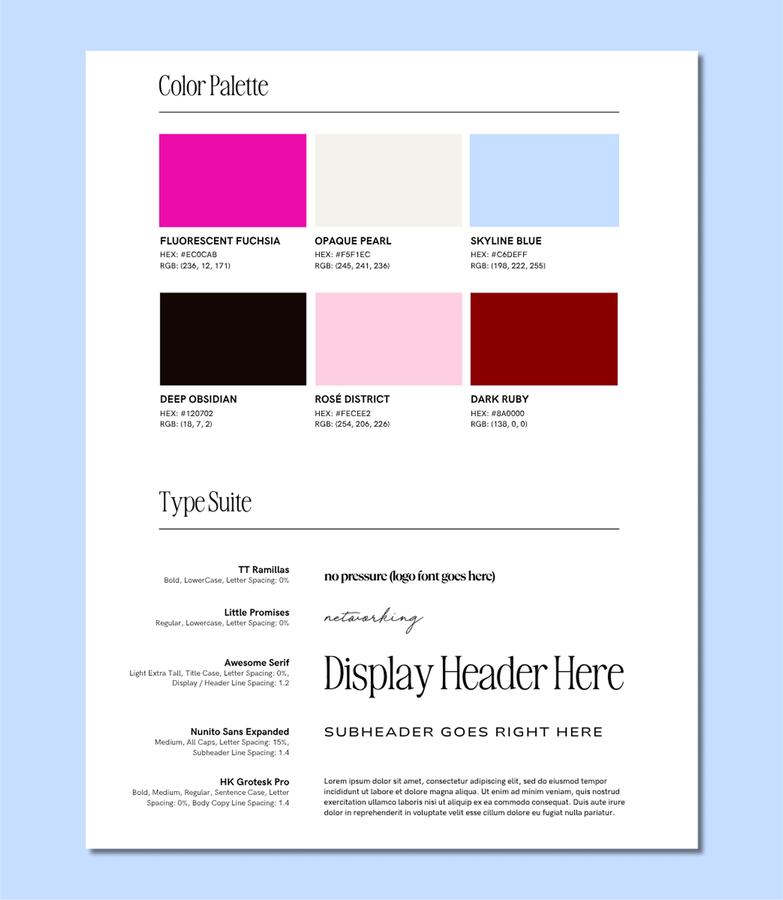
Based on their feedback, we combined the professionalism of Direction 1 with the more warm and vibrant feeling from Direction 3 to create their desired color palette, type suite, and photography direction.
They also requested the use of a handwritten font in the logo, and we paired this with a bold serif font to represent both the personable and the ambitious nature of the company.
Extensive Branding Guidelines

The No Pressure Networking team eventually came back to us for a more in-depth branding guidelines document, happy with our work and trusting us to create a robust resoource that would help them maintain brand consistency.
As the team member assigned to this task, I made sure to establish a cohesive visual system that did not leave room for confusion, ensuring that even the thickness of lines used in their branded material was accounted for. This attention to detail helped elevate the brand and gave them clarity on how to represent themselves across platforms.