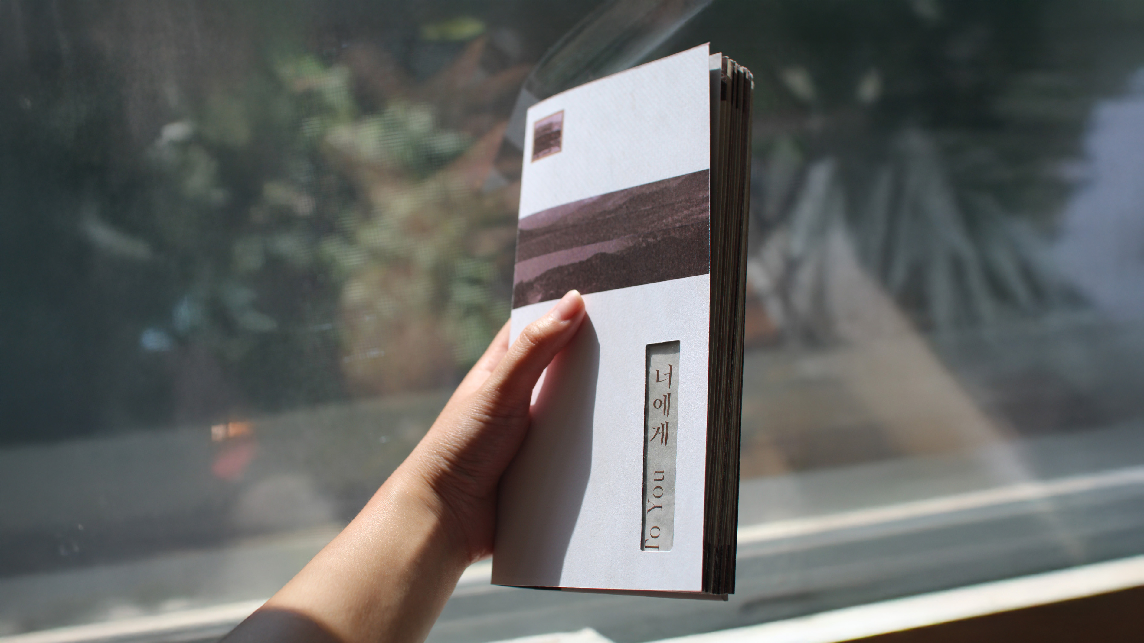
To You Poetry Book
Scope
Bilingual Accordion Book
Book Design
Book Binding
Content Curation
I designed and bound a bilingual art book of Kim Nam-Jo's poetry. I collected poems that each have a sense of sentimentality and alternated the original Korean poems with the English translations. I titled the collection "To You" and designed the book so that the visuals would work in harmony with the content.
The What and Why
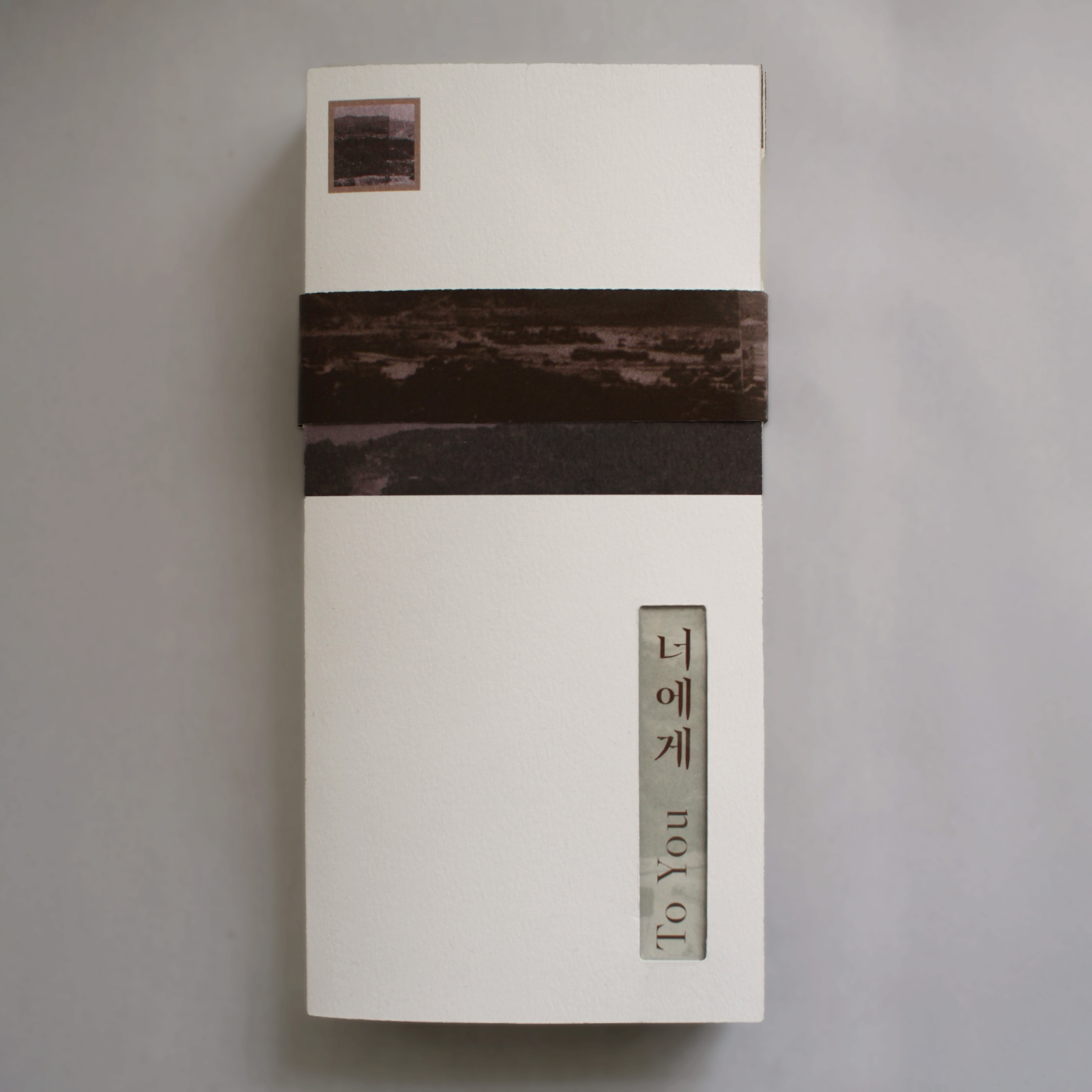
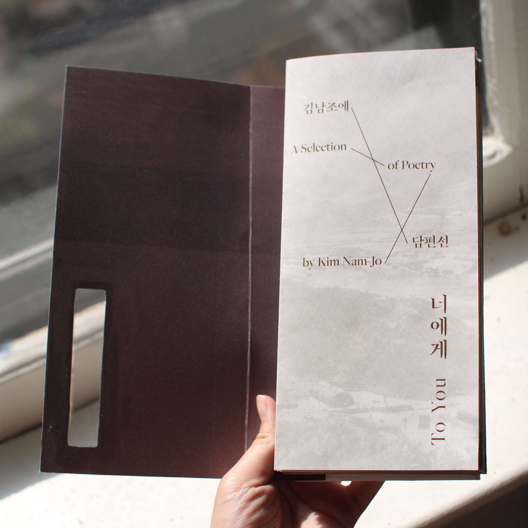
With several poem titles containing the word "letter" or being addressed "to" a recipient, I titled the collection in the same way and designed the cover to resemble on envelope. I achieved this by designing a built in stamp and cutting out a portion of the front cover to reveal part of the title page.
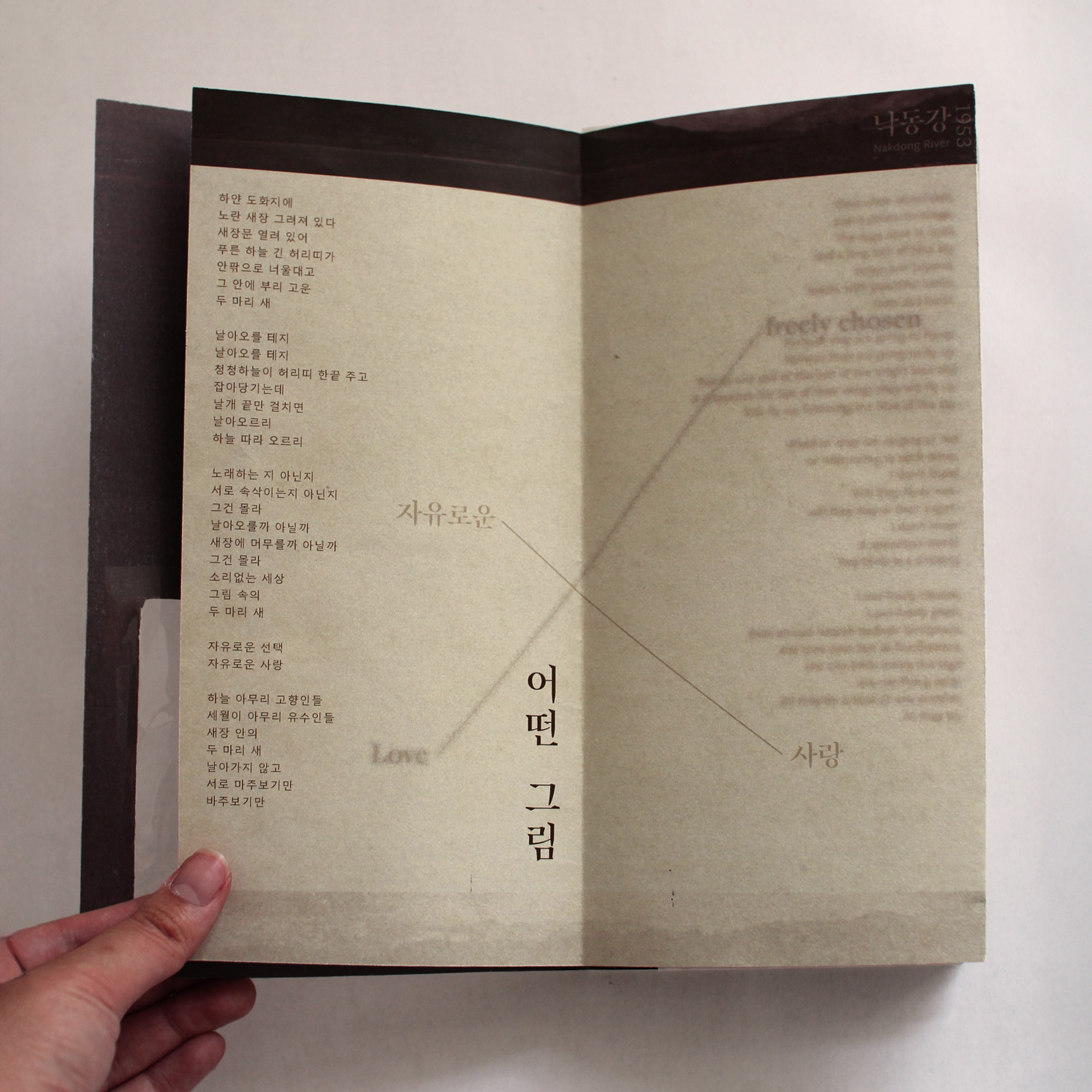
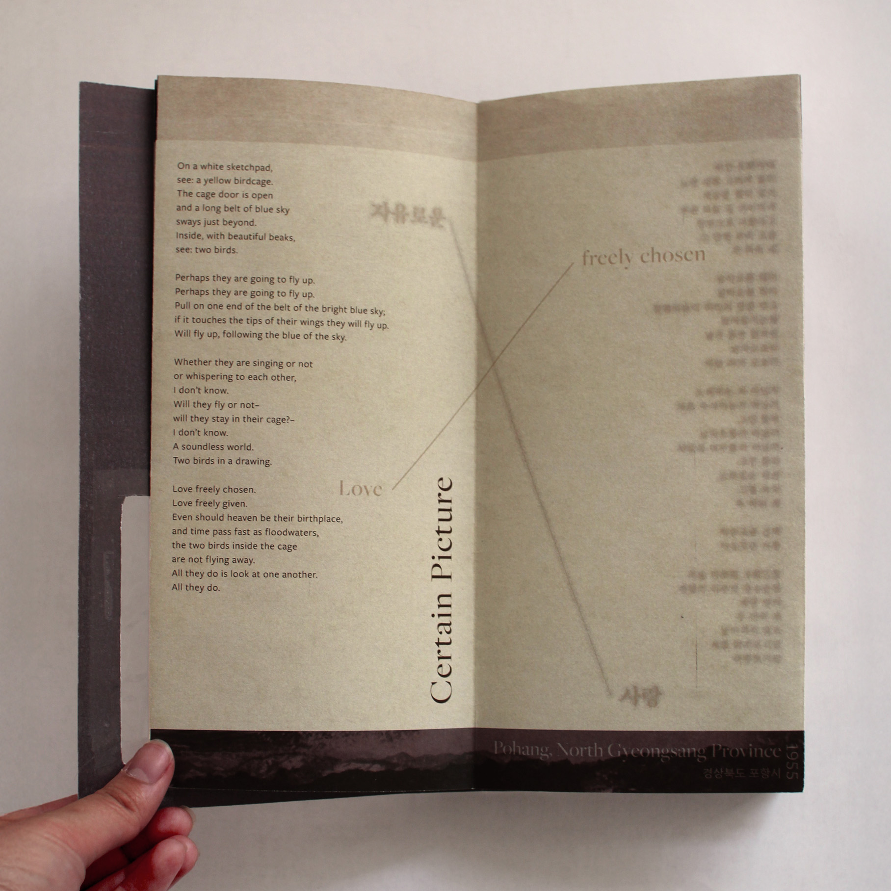
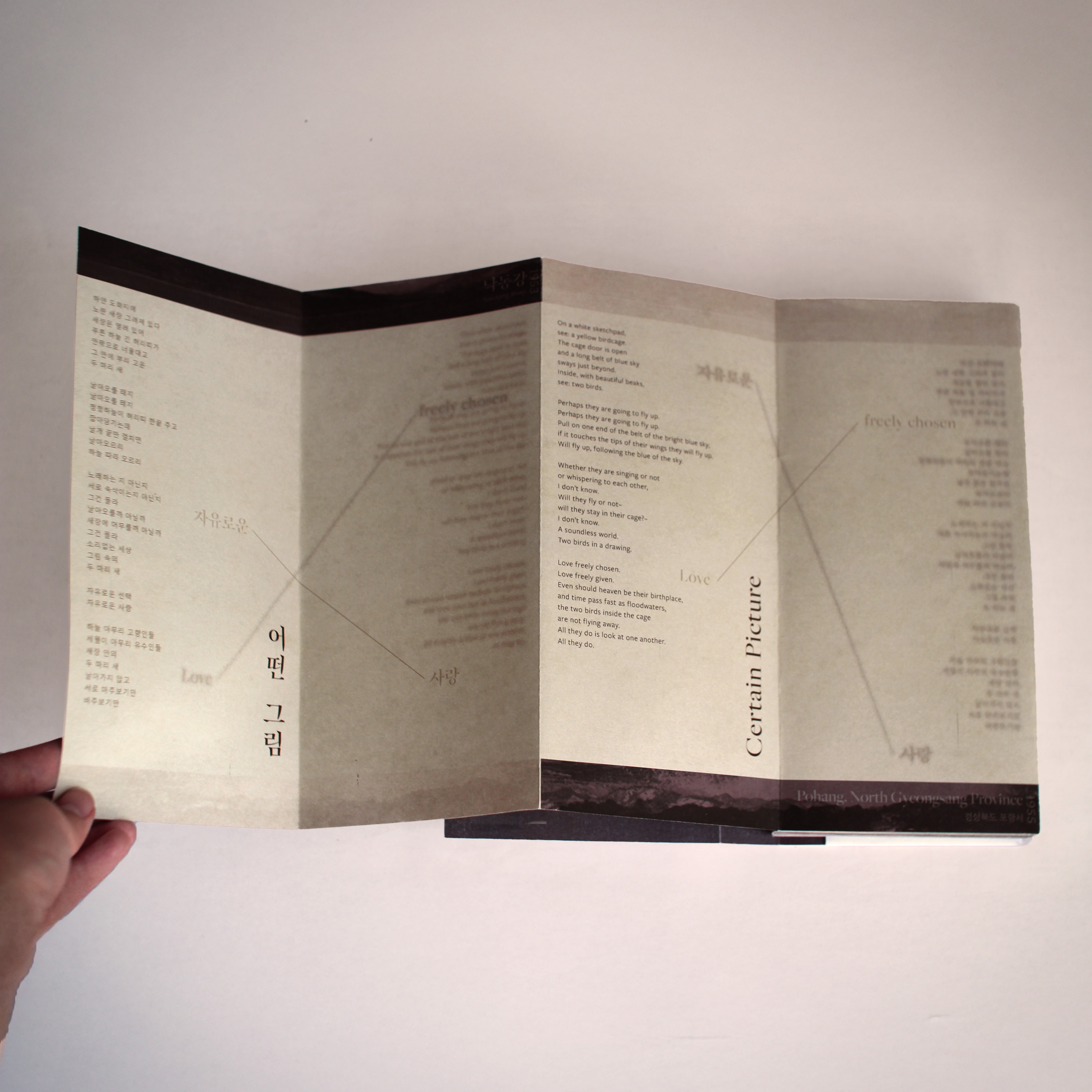
I wanted to integrate the two languages together without distracting from the main language of that page, whether that be Korean or English. So, for each spread I had the main language clear and legible on the left page and the other language version right-aligned and blurred on the right page.
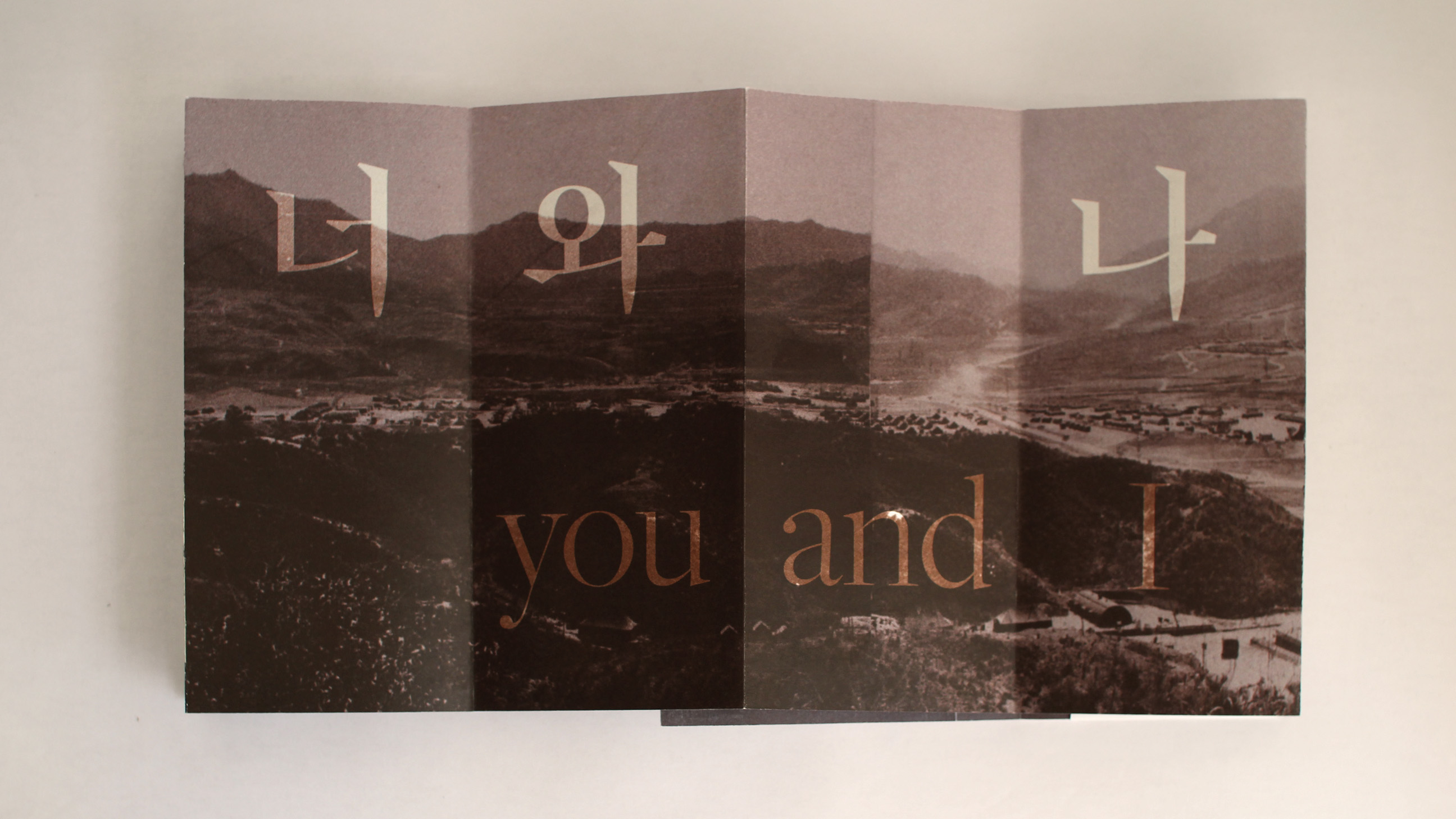
With the accordion book layout, the reader can flip through the poems one by one or spread them out to see both languages at once and/or multiple poems at once.
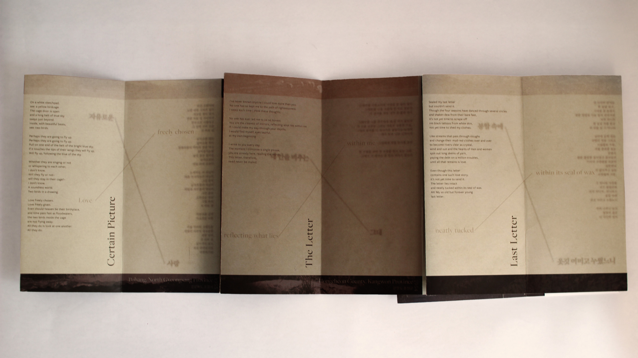
The main reason I decided to use the accordion book style was so that the reader could view all the poems in one language all at once, creating a unique yet convenient reading experiences for both English and Korean readers. Although the poems alternate between Korean and English, as pictured above the accordion aspect of the book allows you to open just the English spreads or just the Korean spreads at once.
To help the reader know which spreads to open for one language or the other, the Korean poem spreads have the upper border of the pages darker and filled while the English poem spreads have the lower border of the pages darker and filled in.
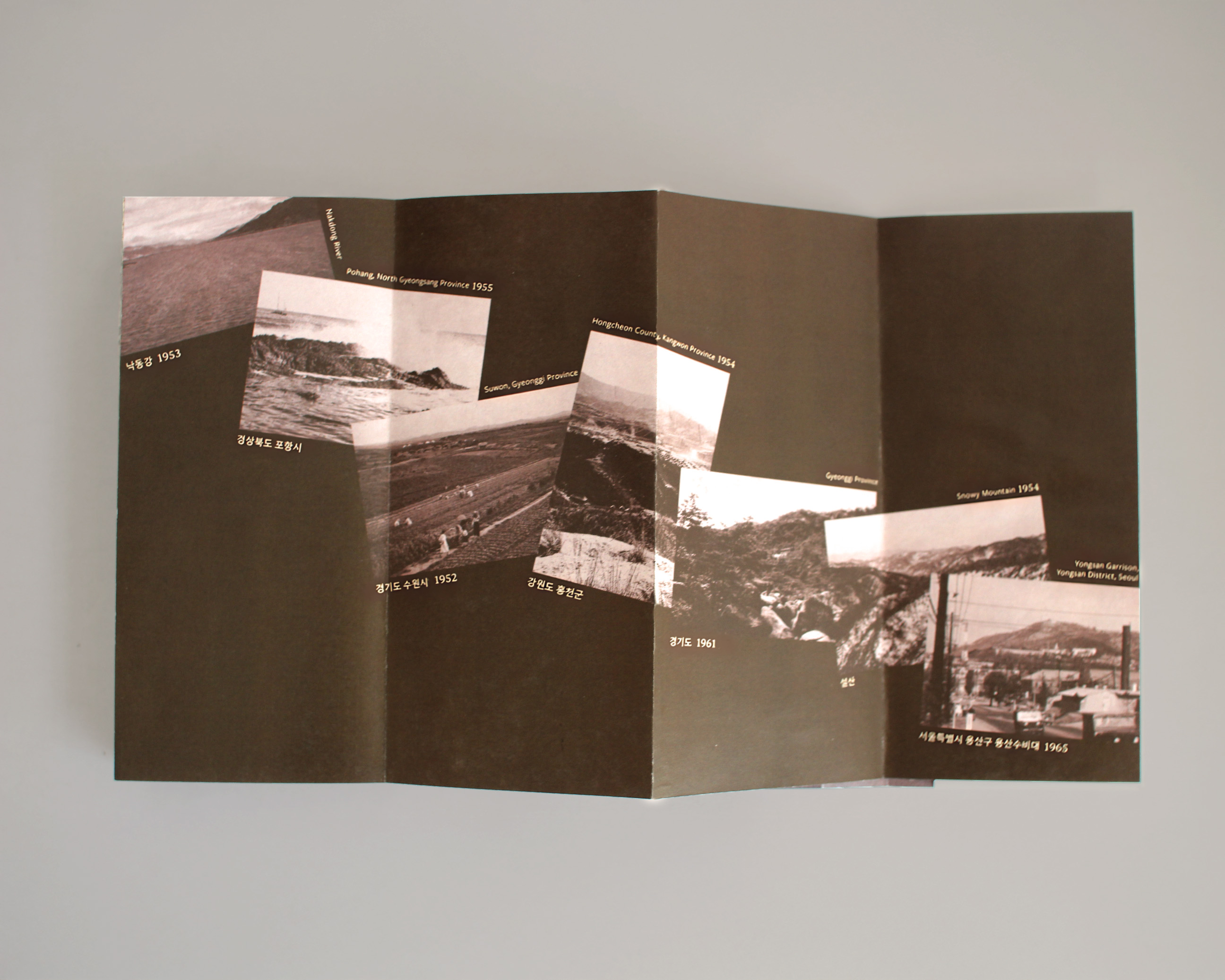
All the imagery used in the decorative border and the full-spread image come from the Korean Image Archive. By color treating historical Korean landscape photography, I was able to incorporate imagery that was both culturally relevant and aesthetically consistent.
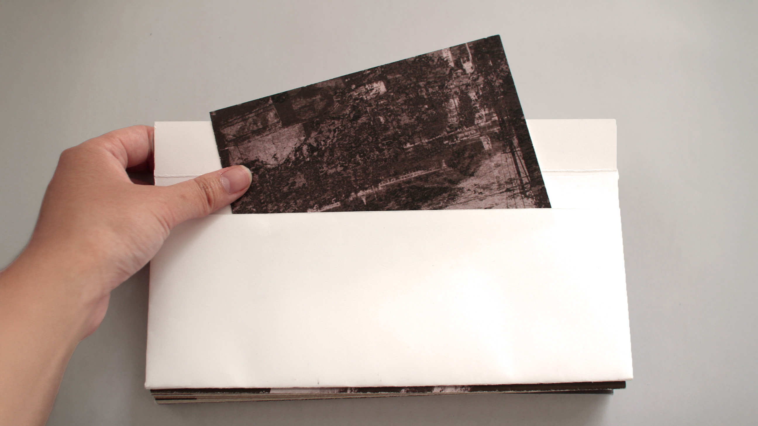
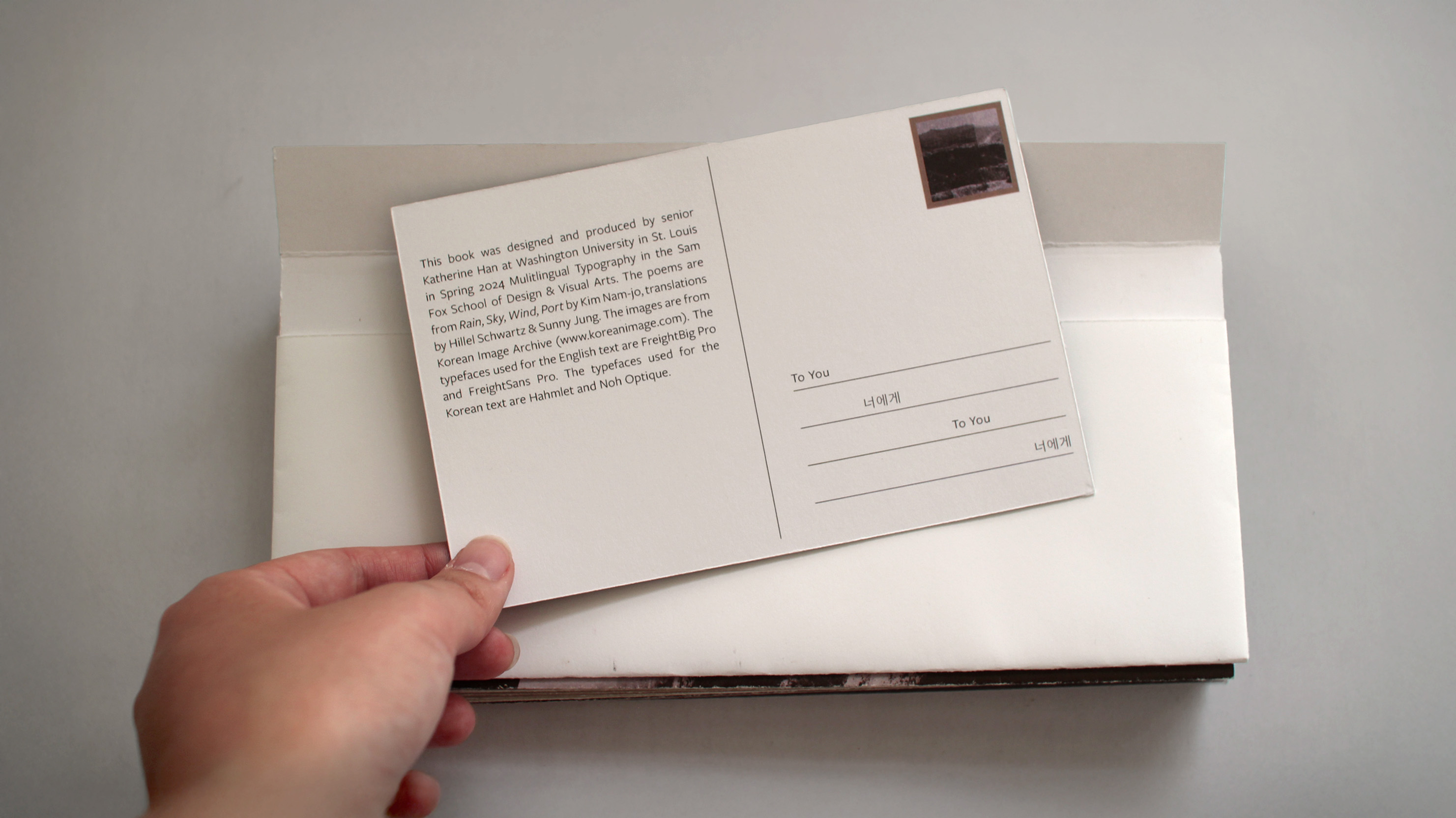
For the back cover of the book, I created a flap and pocket to resemble an envelope like in the front cover. I placed a colophon designed like a postcard inside the back cover so even the credit info was presented in a way that tied into the visual system.