Our Other World
Scope
Bilingual Art Exhibition
Exhibition Identity Design
Title Wall Design
Motion Graphic Teaser
Art Curation
I curated and designed a potential art exhibition for contemporary Korean women photographers. Featuring artists that have an element of surrealism in their works, I built a motion graphic identity that felt like peeking into another realm. I also balanced two languages with two different character systems on equal footing to each other, taking inspiration from existing exhibition design from institutions like MoMA.
The What and Why
Final Exhibition Logo

Earlier Iterations of Exhibition Logo
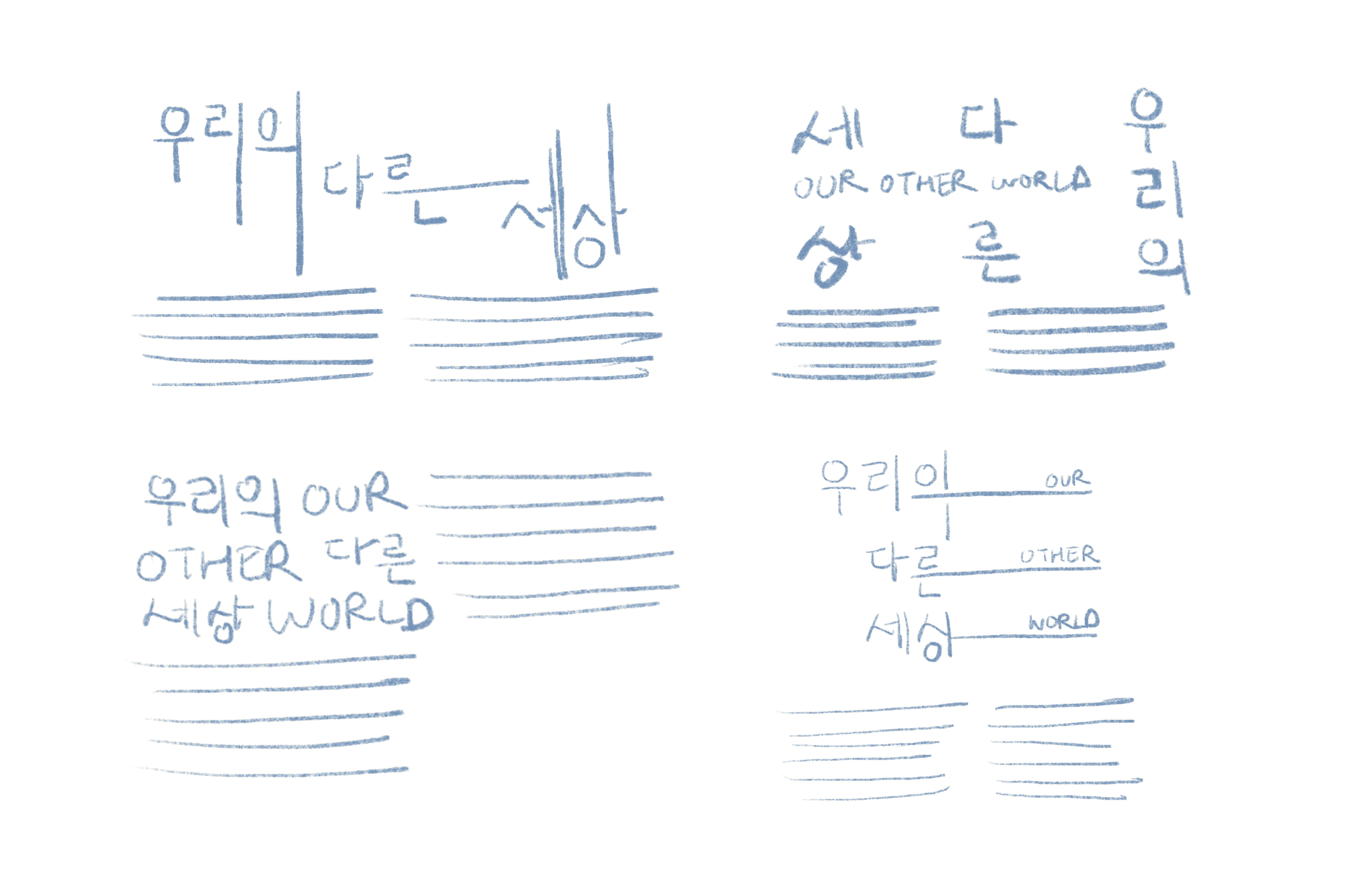
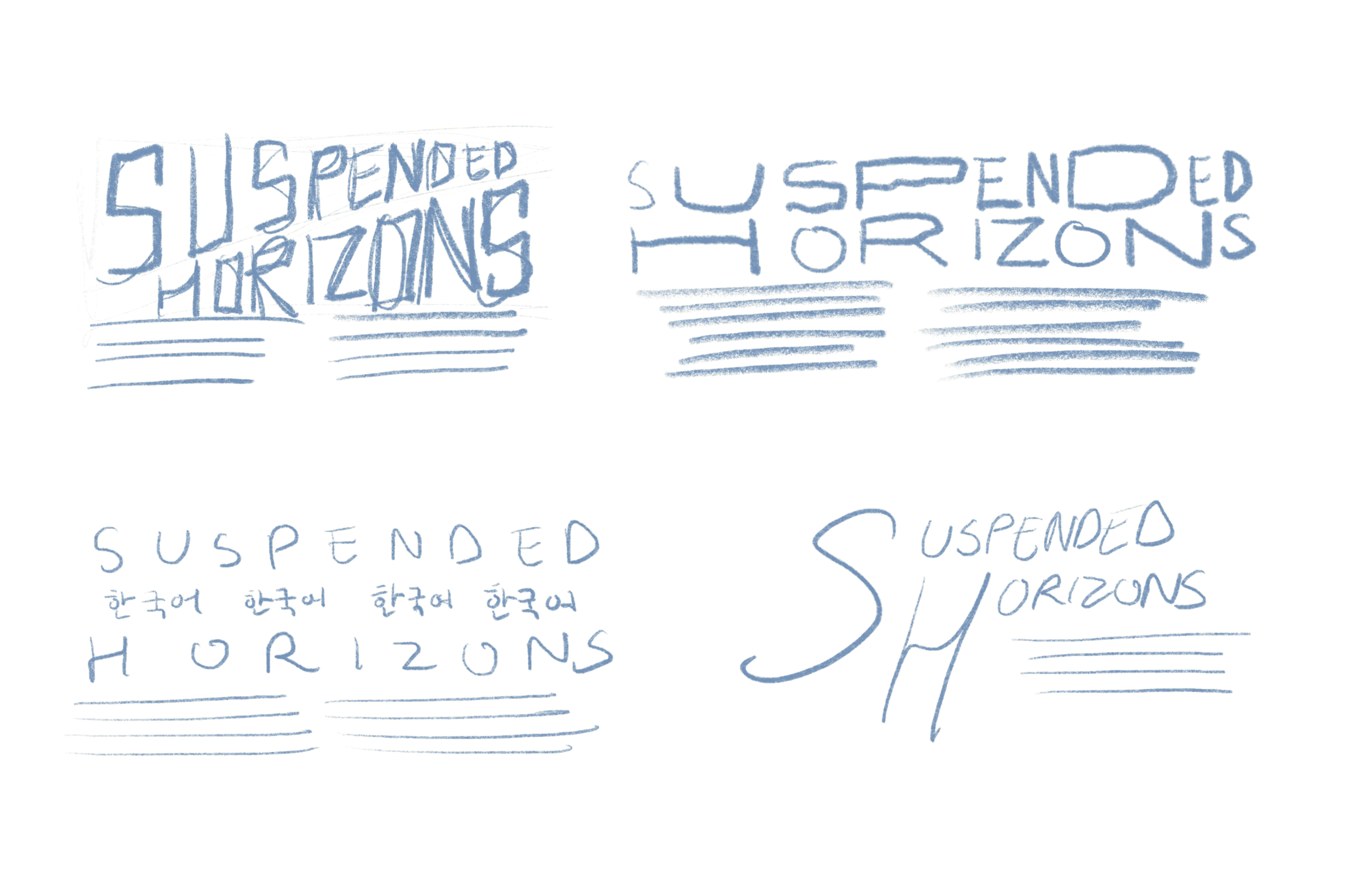
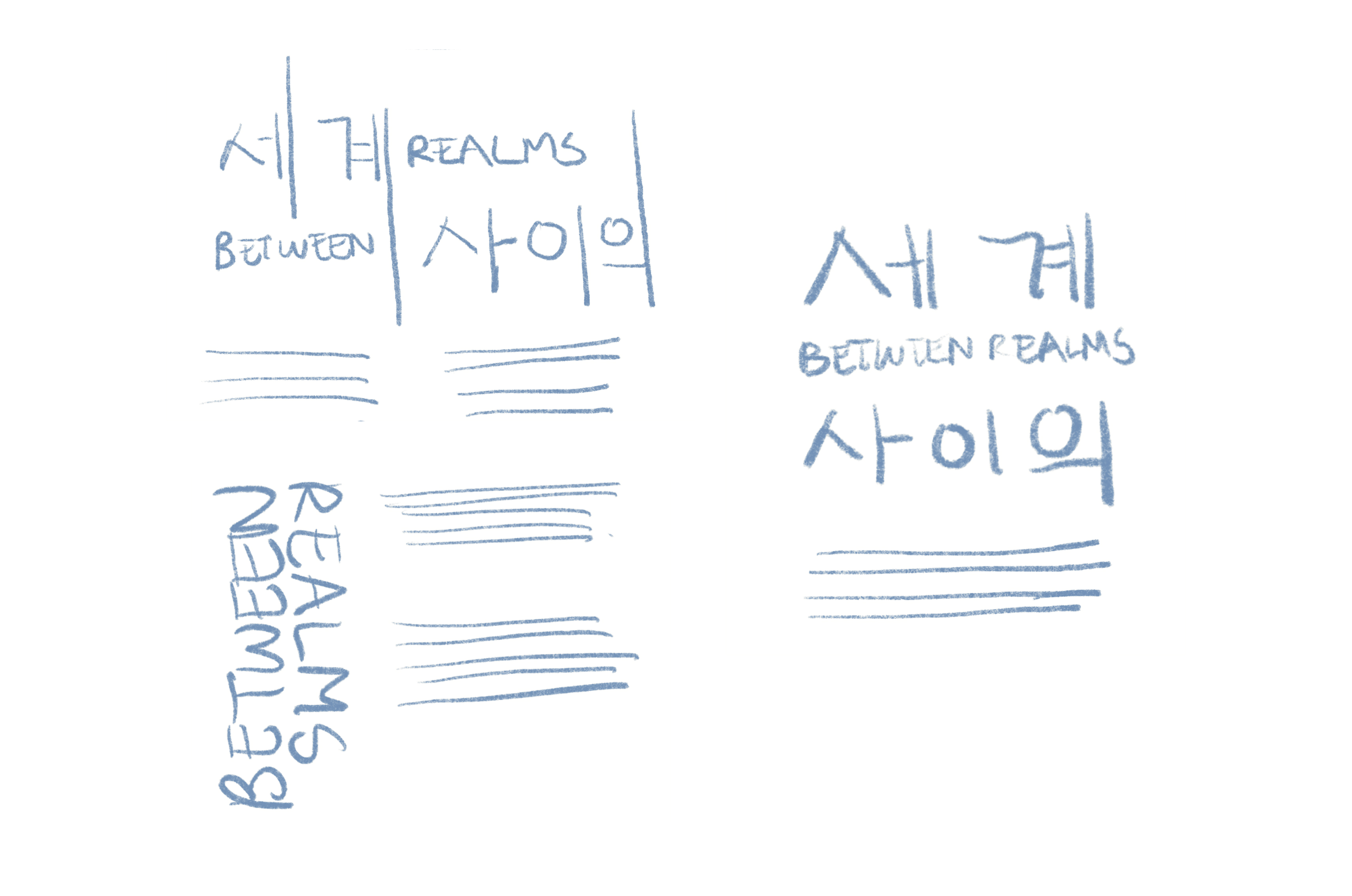
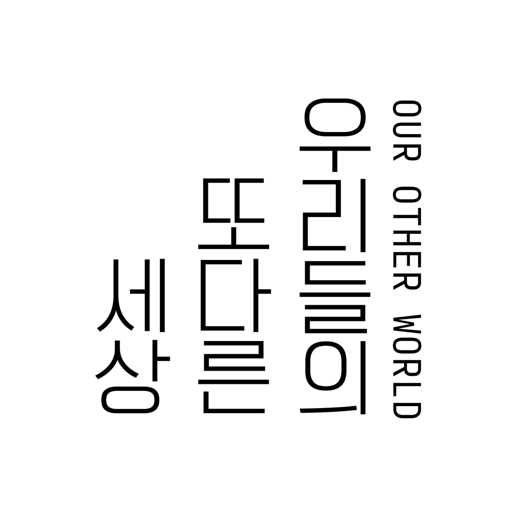
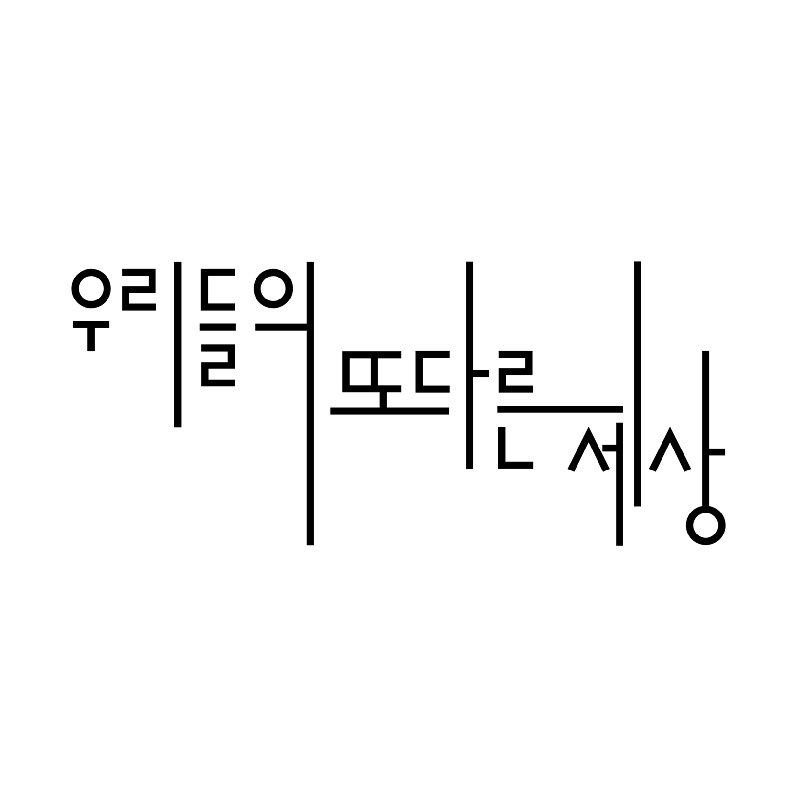
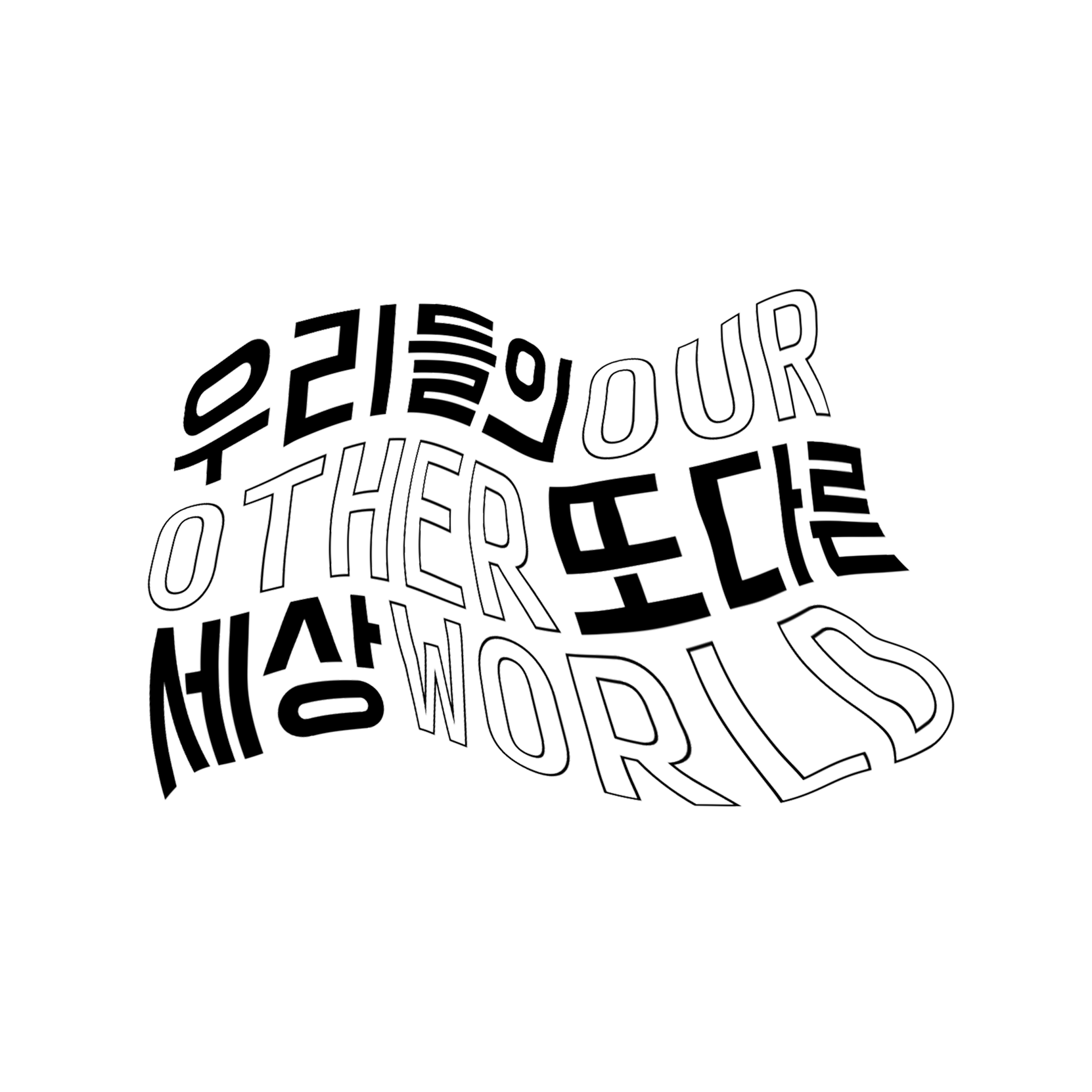
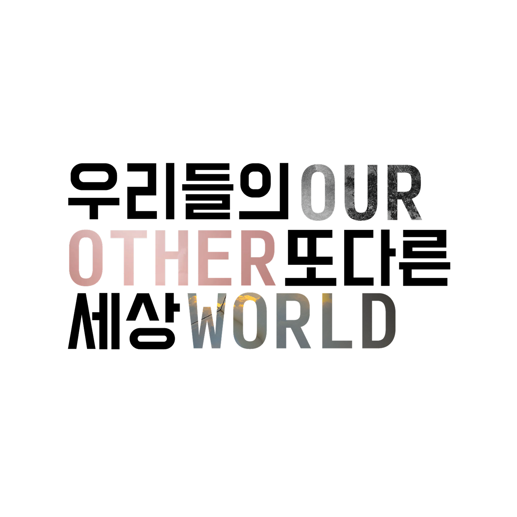
After experimenting with various titles, I decided the name "Our Other World" worked best for both languages since the titles were both three words and the title in one language didn't feel forced compared to the other.
Diving into the exhibition design, I wanted the identity to lend well to motion graphics. I played with warp, multi-directional extension, and treating the letters as windows to the imagery, but I ultimately chose the direction I felt was clean and simple, but still flexible.
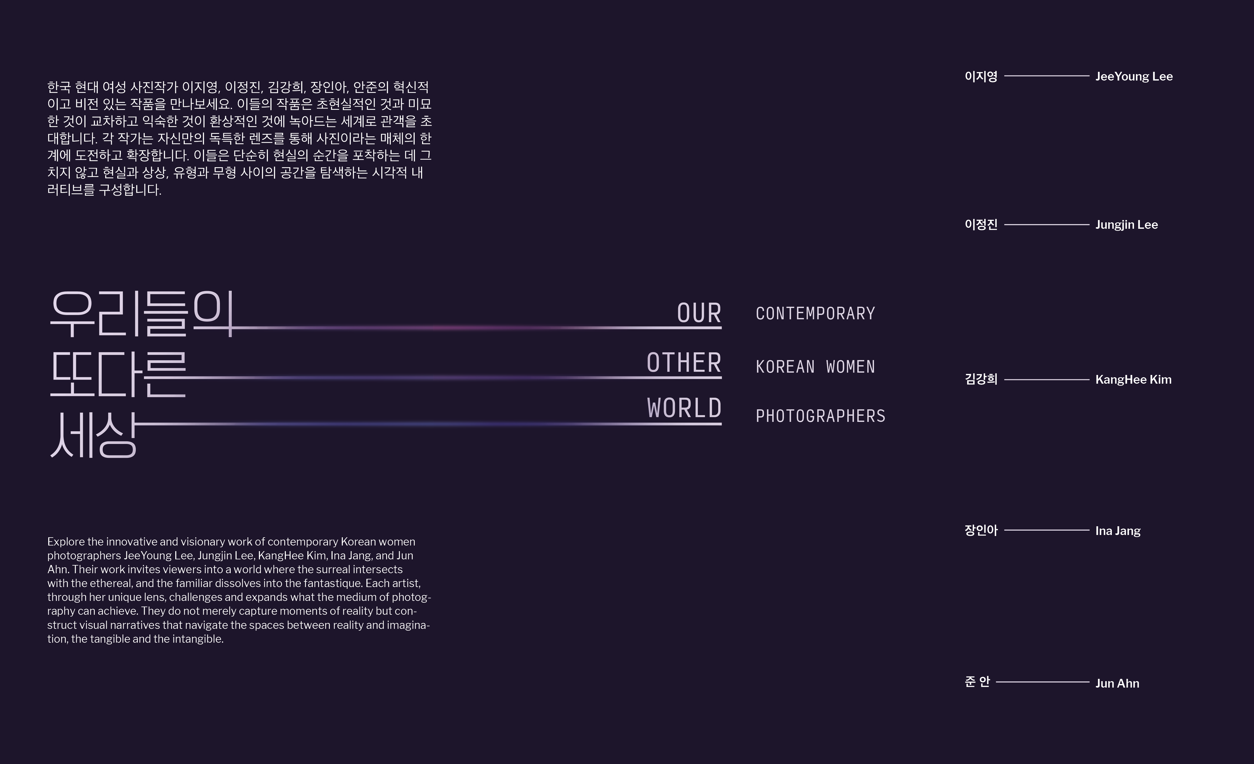
Final Title Wall
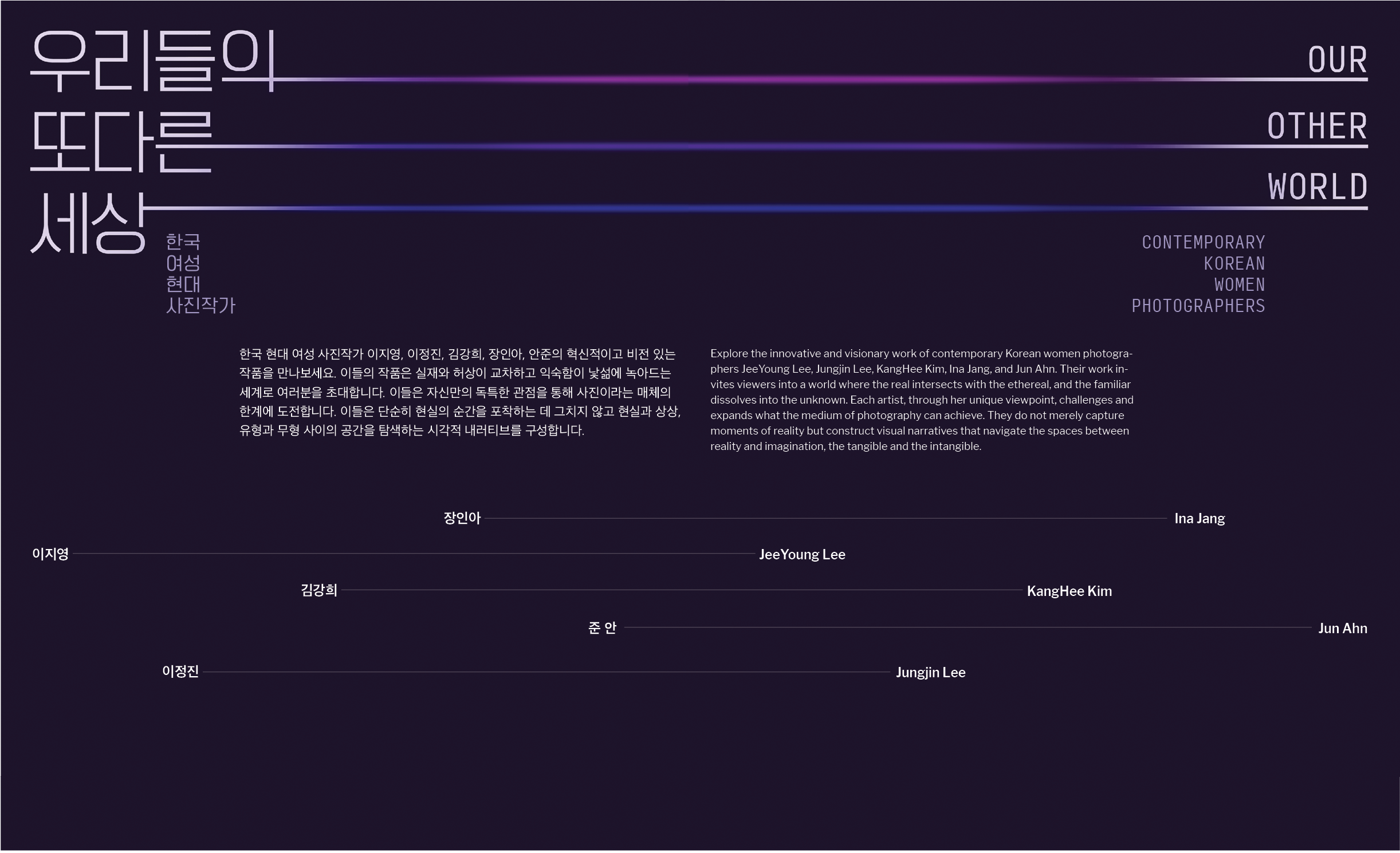
Earlier Iterations of Title Wall
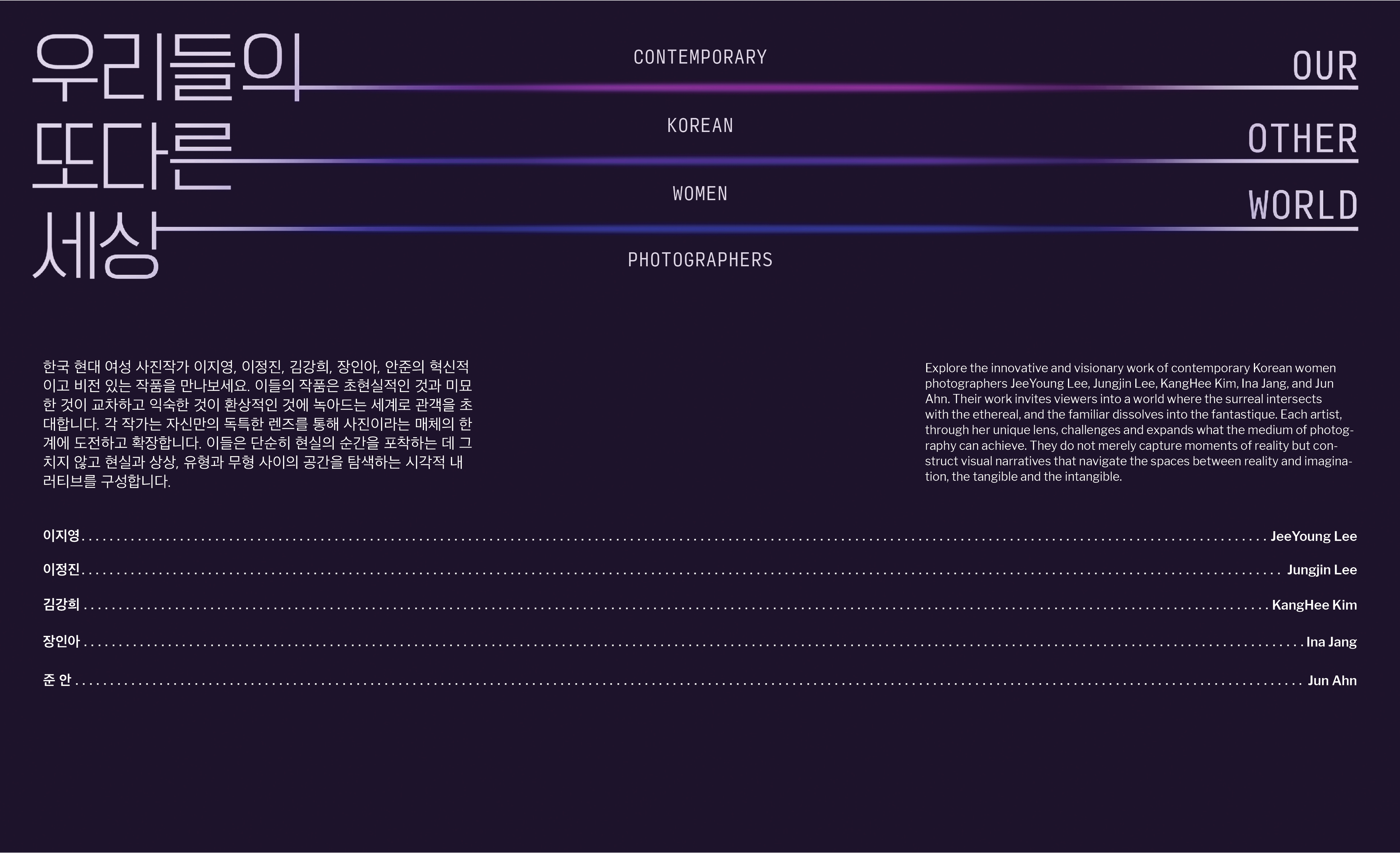
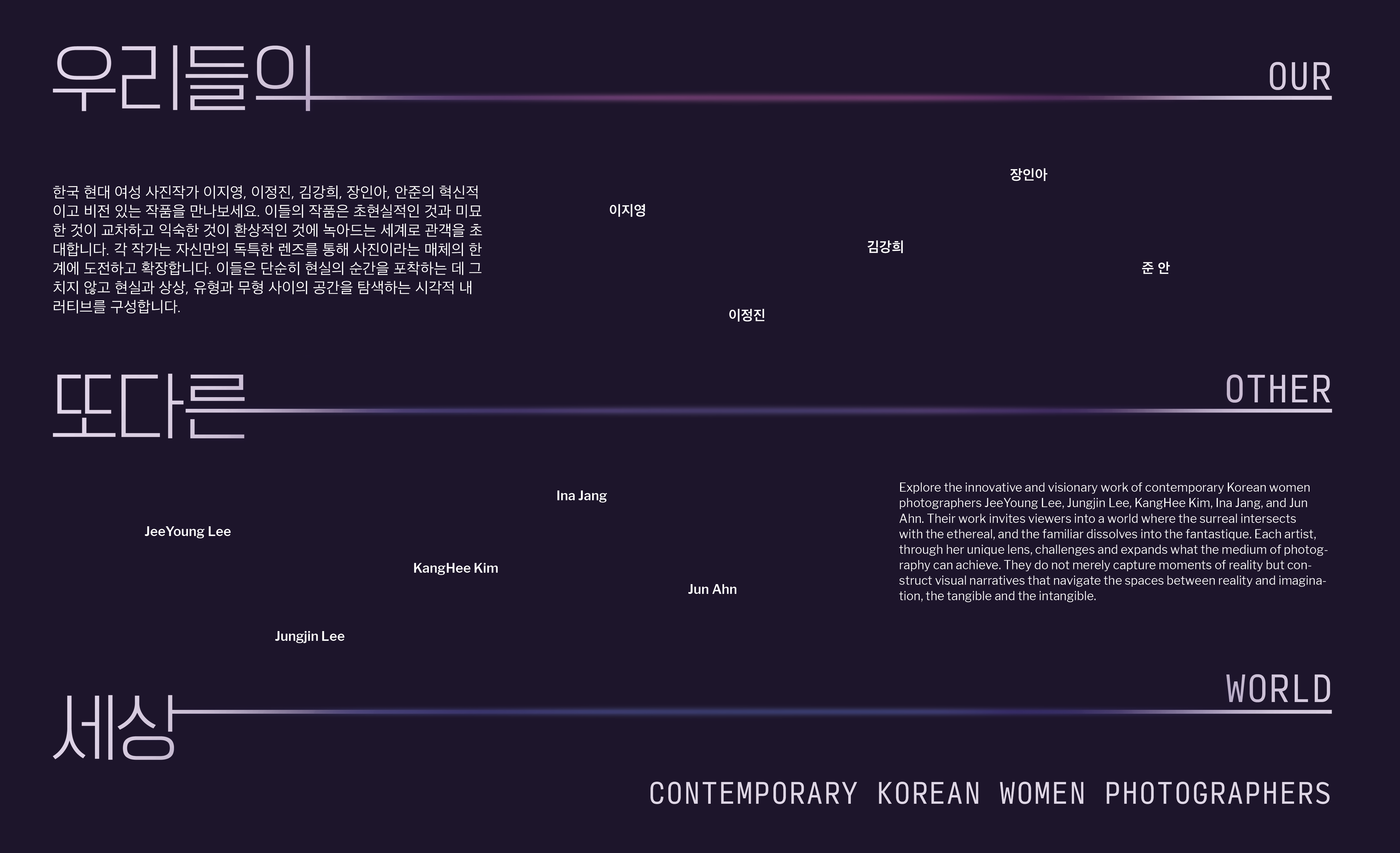
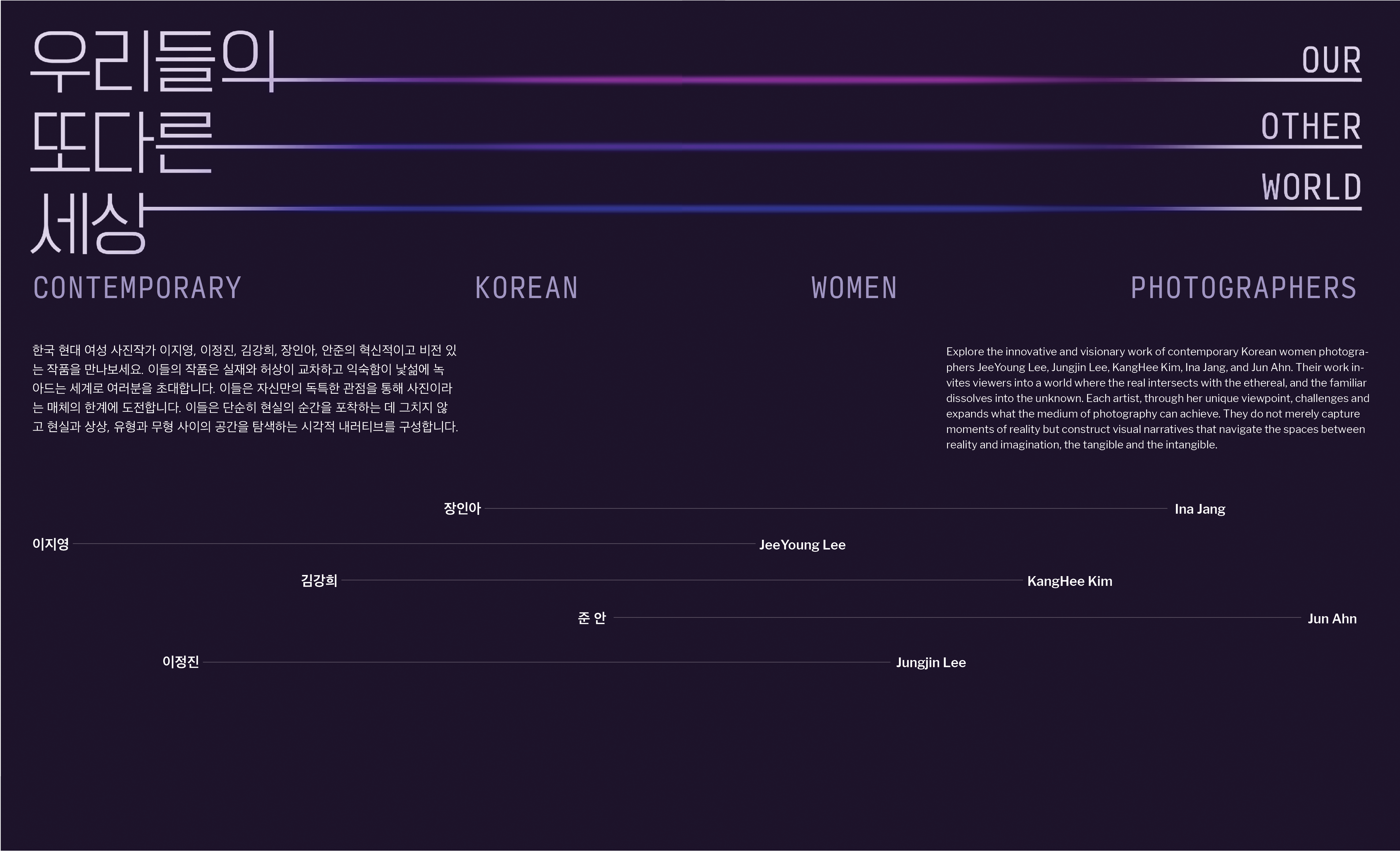
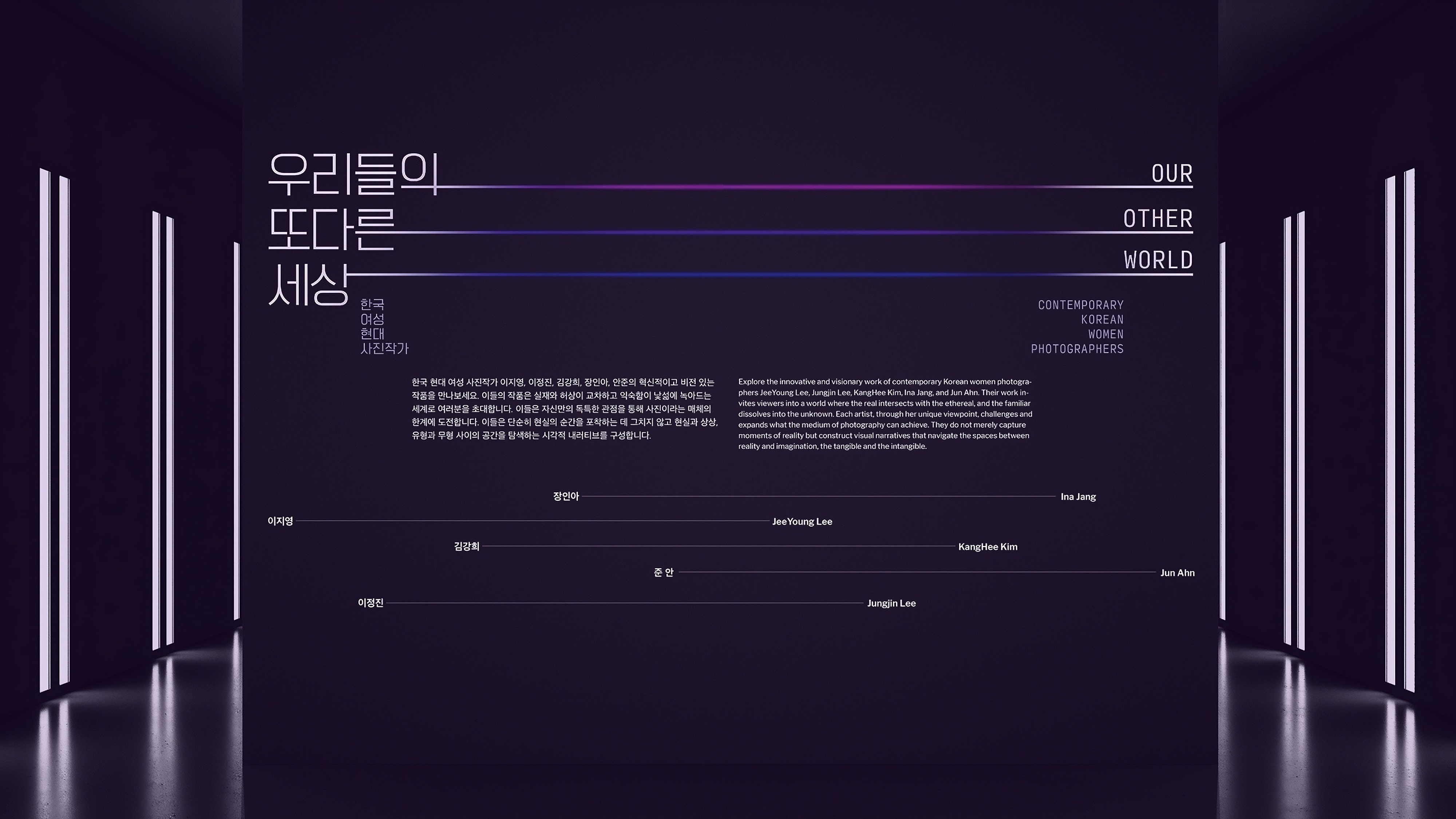
I wanted the title wall to be visually dynamic but also easy to navigate for both languages. In earlier iterations, the designs felt either too rigid with all the text hugging the sides or too confusing with the text too staggered and not arranged in an intuitive reading order.
For the final title wall, I struck this balance by staggering the bodies of text in a controlled funnel shape except for the names and keeping each language to one half of the wall (Korean on the left and English on the right). Each language can be read easily on its own while having equal visual weight to the other.
Full Animated Teaser
Korean characters are great with retaining legibility while being stretched because it is such a geometric language system, and I made sure to use that to my advantage in the exhibition identity and motion graphic teaser.
After I extended the Korean title and fazed in the English title, I used the lines as windows into the artwork. This is to give a sense of peeking into another dimension, nodding at the surrealism of the photography itself.